All posts by Kent Kroeger

The trade-off between economic growth and coronavirus containment

[Headline graphic: Components of the coronavirus: The Spike S protein, HE protein, viral envelope, and helical RNA; Graphic by https://www.scientificanimations.com; Used under the CCA-Share Alike 4.0 International license.]

By Kent R. Kroeger (Source:  NuQum.com; October 19, 2020)

Our World In Data (OWID), a non-profit organization that provides open-source access to worldwide economic and development data, recently asked a simple question on its website: Have the countries experiencing the largest economic decline performed better in protecting the nation’s health, as we would expect if there was a trade-off?

Using cross-sectional data for 38 countries on 2020-Q2 GDP growth and the number of COVID-19 deaths per capita (through June 30th), their answer was as straightforward as their question:

“Contrary to the idea of a trade-off, we see that countries which suffered the most severe economic downturns – like Peru, Spain and the UK – are generally among the countries with the highest COVID-19 death rate.

And the reverse is also true: countries where the economic impact has been modest – like Taiwan, South Korea, and Lithuania – have also managed to keep the death rate low. 

As well as saving lives, countries controlling the outbreak effectively may have adopted the best economic strategy too.”

OWID’s finding is consistent with other expert findings on the economic trade-offs associated with controlling the coronavirus:

“The coronavirus trade-off was always an illusion. Lockdown or not, there is no alternative to conquering the disease if economies are to recover,” Bloomberg economics writer John Authers concluded in June after comparing Denmark, a country that implemented a strict lockdown early in the pandemic, and Sweden, a country that eschewed stringent lockdown measures and instead sought to achieve ‘herd immunity’ as quickly as possible. According to Oxford University’s Coronavirus Government Response Tracker (OxCGRT), Denmark’s average stringency index score through June 30th was 41 (on a 0 – 100 scale where 0 = “No policy response” and 100 = “Maximum policy response.”). In contrast, Sweden’s average score was 25.

The current data for Denmark and Sweden bolsters Authers’ conclusion. As of October 18th, according to John Hopkins University’s coronavirus tracking website, Denmark has experienced 119 COVID-19 deaths (per 1 million people), compared to 581 for Sweden. In turn, their two economies shrank by similar amounts in this year’s second quarter (-8.5% for Denmark and -8.3% for Sweden). By any objective measure, Denmark has done better than Sweden in combating the coronavirus while protecting its economy.

Statistical simulation studies on the coronavirus-economic trade-off also support the general conclusion that strict containment policies (e.g., large-scale testing and quarantines) are superior to a “no policy” approach. Using simulation models combining economic and epidemiological behaviors, economists Martin Eichenbaum, Sérgio Rebelo, Mathias Trabandt recently summarized this trade-off:

“The results suggest that testing and quarantine policies should play a central role in minimising the social costs of the COVID-19 crisis.”

The authors further noted that “the optimal simple-containment policy makes the recession worse than the no-intervention equilibrium. But the policy improves welfare because it saves an enormous number of lives.”

However, the political pressure to abandon strict containment policies because of their economic costs has proven too powerful for many public officials. The authors specifically cite the U.S. experience where many states prematurely abandoned initial containment measures which led to “short-lived economic revival followed by a surge in infections, epidemic-related deaths and a subsequent second recession.”

Donald Trump is probably not going to be re-elected president largely because of that strategic error in judgment.

Are strict containment policies (e.g., lockdowns) the key to containing the coronavirus and saving the economy?

In the U.S. case, how long did those strict lockdown measures need to be maintained during the first wave in order to minimize the second wave? Until ‘zero new infections’ were recorded for a specific amount of time? Until hospital ICU utilization rates fell below a certain threshold? Until there was a vaccine?

One problem with making definitive statements in any direction regarding coronavirus containment policies is that the pandemic is ongoing (the world reported a daily record of 411 thousand new coronavirus cases on October 16th, according to Johns Hopkins University). Everything is a moving target right now. Furthermore, the economic costs of strict coronavirus policies are often felt immediately, while their benefits can be delayed for weeks, even months. In such a dynamic environment, relating specific policies to specific outcomes (e.g., economic growth, COVID-19 deaths) is not easy.

But despite these methodological problems, researchers do have the benefit of hundreds of test subjects (i.e., countries) employing different coronavirus containment strategies at different points in time; and though they cannot randomly assign countries to specific containment strategies, there are quasi-experimental controls to mitigate the downside of that problem.

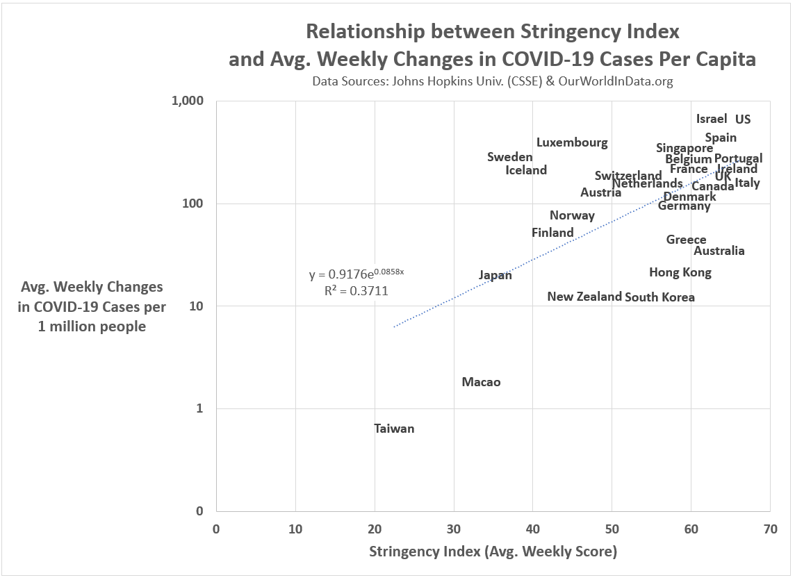
In the midst of these challenges, evidence is emerging that suggests strict lockdown policies are not the only (or even the best) approach to coronavirus containment. This becomes apparent when we compare countries based on the strictness of their coronavirus policies (as measured by Oxford’s Stringency Index), their cumulative number of COVID-19 deaths (per 1 million people), and their economic health (as measured by changes in GDP).

An Analysis of Economic Growth and Coronavirus Containment in 38 Countries

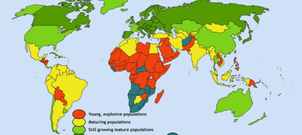
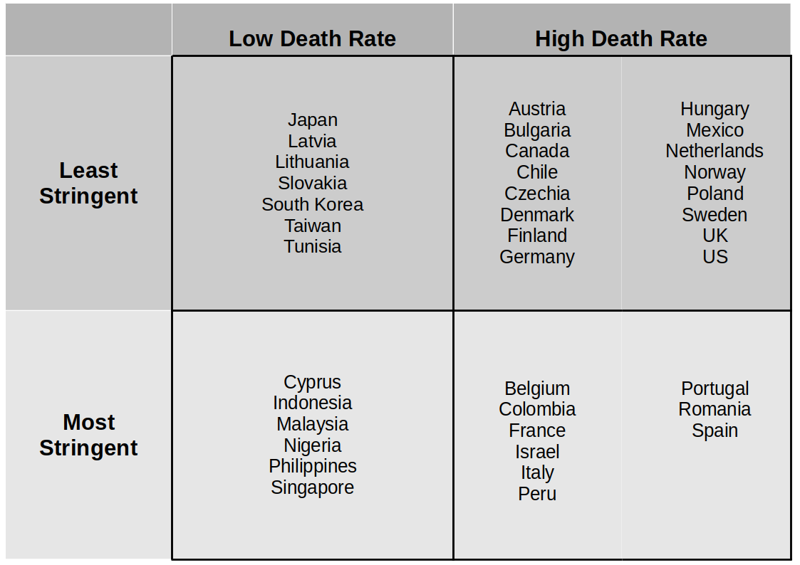
Figure 1 lists the 38 countries OWID used in the following trade-off analysis of coronavirus containment policies and economic growth for the period from January 1st to June 30th, 2020. Each country was placed into one of four quadrants based upon their relationship to the sample average for COVID-19 cumulative death rates and the strictness of coronavirus containment policies. For example, Japan and Latvia have (so far) experienced below average COVID-19 death rates while implementing some of the least stringent coronavirus policies. In contrast, Belgium and Portugal have seen above average COVID-19 death rates while pursuing some of the strictest coronavirus policies.

Figure 1: The 38 countries in this study sorted by coronavirus policy strictness and COVID-19 cumulative death rates (from January 1 – June 30).

Recall the conclusion from OWID: There is a positive relationship between low COVID-19 death rates and GDP growth rates—the presumption being that effectively fighting the coronavirus is a necessary condition for a nation’s economic health.

You’ll get little argument from me on that conclusion, but the question remains, how does a country “effectively” fight the coronavirus?

Oxford’s Stringency Index (SI) is a semi-weekly index measuring the strictness of a country’s coronavirus policies (e.g., economic lockdowns, school closings, mandatory contact tracing, etc.). From January to June, using a daily average, the Stringency Index rated the policies in the Philippines (SI = 61.3) as the strictest in the world, followed by countries such as Peru (56.2) and Italy (54.9). This conforms with news media accounts in those countries (Philippines, Peru, Italy).

On the other side of the coin, the SI rated the coronavirus policies in Taiwan (23.0), Sweden (25.4) and Japan (29.8) among the least strict from January to June. This too conforms with media accounts (Taiwan, Sweden, Japan).

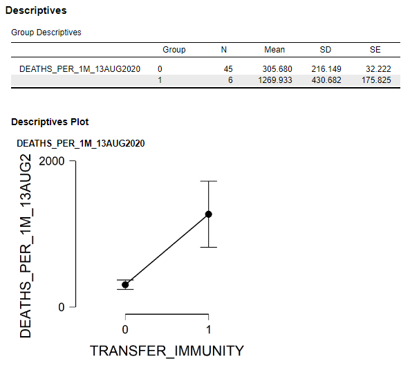
With this information, I calculated the average GDP growth rate (Q2) in each of the four quadrants in Figure 1 (Note: the average was not weighted by population). Figure 2 shows the Q2 GDP growth averages for the four country groups.

Figure 2: Average GDP Growth (2020-Q2) by Policy Stringency Index and COVID-19 Deaths (per capita) Categories (n = 38 countries; numbers on vertical bar represent upper and lower estimates)

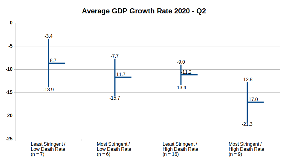
Only the difference in GDP growth rates between the first quadrant (Least Stringent/Low Death Rate) and the fourth quadrant (Most Stringent/High Death Rate) is statistically significant (t-statistic = -2.45, p = 0.028). However, within the two High Death Rate quadrants (i.e., the two plots on the right in Figure 2), there is an indication of a negative relationship between strict coronavirus policies and GDP growth: In countries hard hit by the coronavirus, it is those countries with the strictest policies that have had lower economic growth.

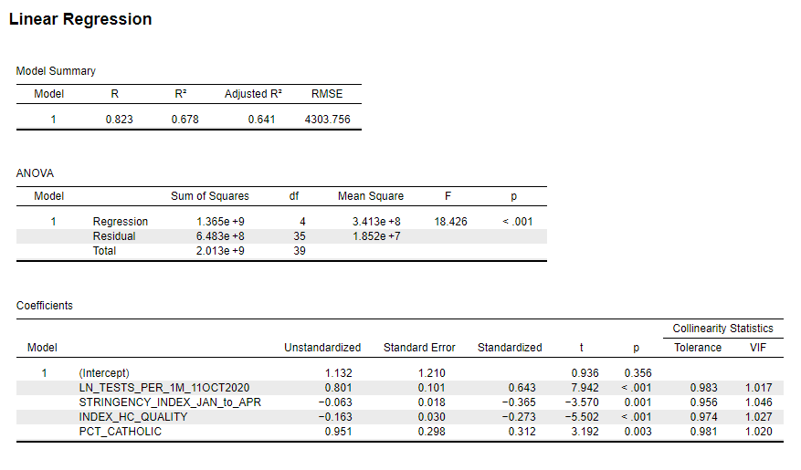
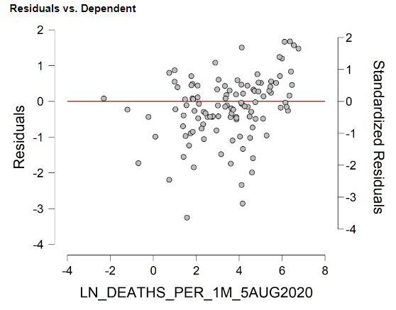
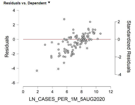
For a further look at these relationships, I estimated a linear model of GDP growth rates for the 38 countries, with policy strictness (average Stringency Index over the period) and the cumulative COVID-19 death rate (per 1 million people) as independent variables (see Appendix, Figure A.1). Both independent variables are statistically significant (negative) correlates with GDP growth, and with similar strength. High coronavirus death rates are associated with lower economic growth. But so are strict coronavirus policies. It leaves policymakers with an apparent ‘Damned if I do, and damned if I don’t’ choice to make when combating the coronavirus. [Though, somehow, countries such as Japan and South Korea were able to keep their death rates low while simultaneously keeping their economies relatively open.]

Final Thoughts

Sweden may have opted for the wrong strategy in controlling the coronavirus, but the net result, economically, has been similar to other European countries that adopted much stricter policies.

It is not an accident that Germany Chancellor Angela Merkel has already indicated Germany will not implement strict lockdown policies during the current, second wave of the coronavirus in Europe. Germany will find alternative, presumably more economically friendly, policies to combat the coronavirus.

“We all want to avoid a second national shutdown and we can do that,” Merkel told a session of the German Bundestag.

If you want to find economic success stories during the 2020 coronavirus pandemic up to now, don’t look to Denmark or Germany, look in East Asia.

I have my theory as to why this may be true: Culture. Culture. Culture.

Viruses do not spread as fast in cultures where people self-isolate when they feel sick, and where masks in public out of habit and kindness. Any threat to their personal freedom and privacy from aggressive contact tracing is perceived as minor compared to the potential benefit to the societal collective. And it is not top-down, state-dictated collectivism at work in countries like South Korea and Japan, but the bottom-up variety: people didn’t need to be told wearing masks and keeping their social distance was the right thing to do, they already knew.

Personal liberty helped forge the great economies of Europe and North America in the 19th and 20th centuries, but the idea that collective (bottom-up) rationality may be the engine behind future economic growth is hard to swallow for many of us raised on the moral certitude of the Founding Fathers and American exceptionalism.

The coronavirus might be making that economic philosophical battle even more palpable.

  • K.R.K.

Send comments to: nuqum@protonmail.com
or DM me on Twitter at: @KRobertKroeger1


Research Postscript:

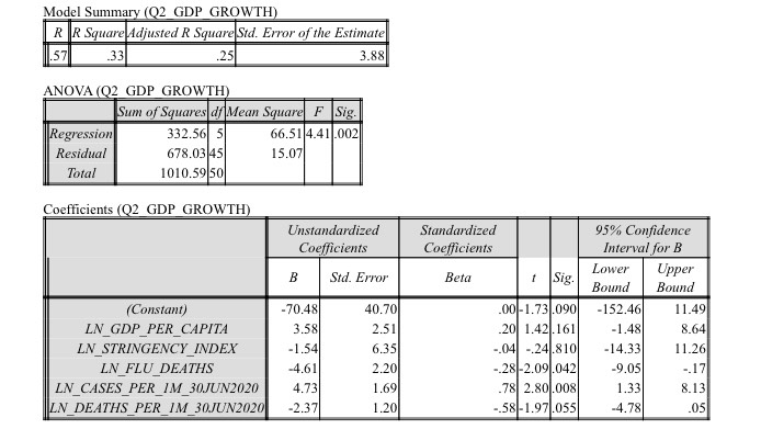
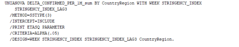
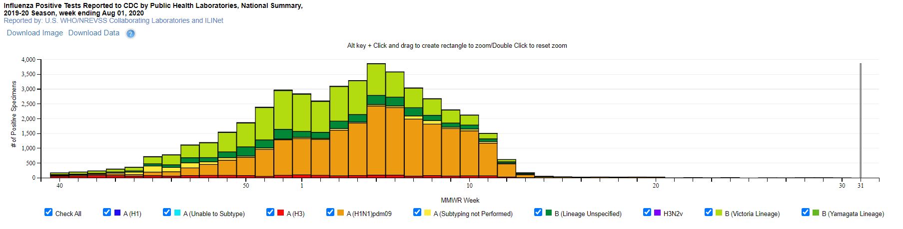
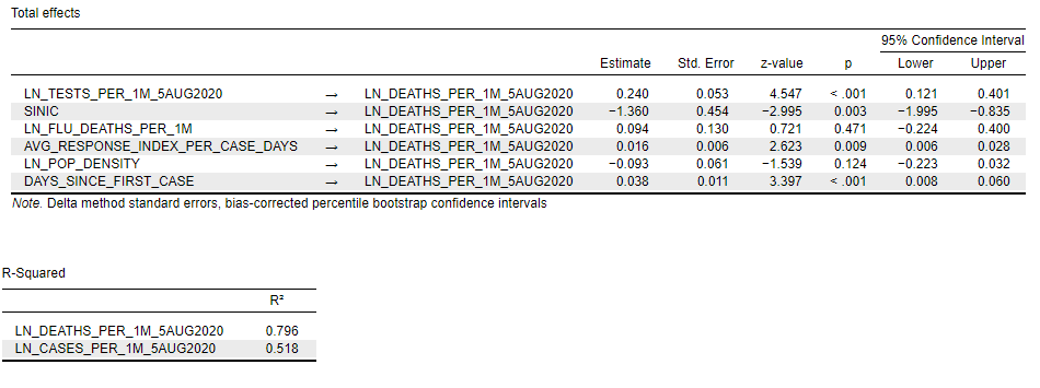
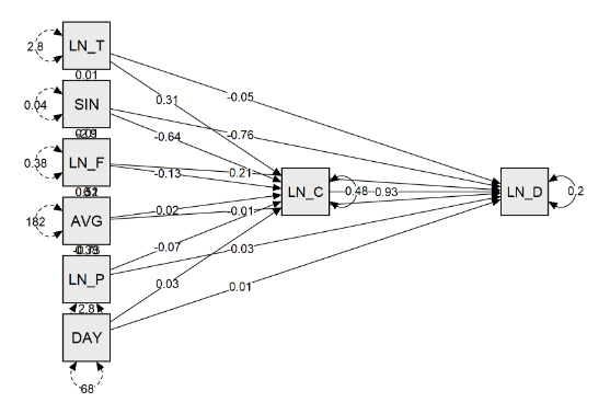
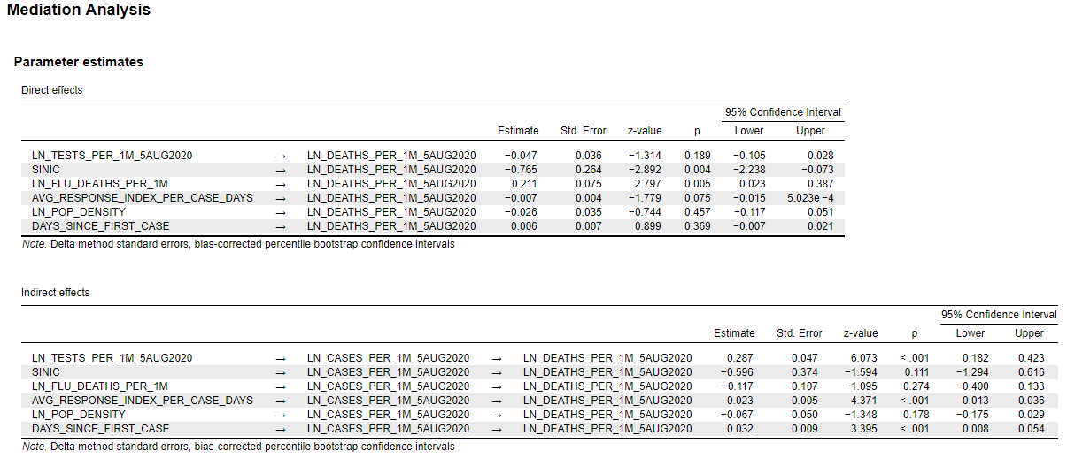
Along with estimating a linear model for GDP growth among the 38 selected countries, I also estimated a similar model for the 50 U.S. states (plus District of Columbia). That regression model is shown in the Appendix (Figure A.2). Compared to the world model and its two predictors of GDP growth (Figure A.2), the U.S. model was not a particularly good fit of the data, despite having five predictors. Surprisingly, the strictness of state coronavirus policies (as measured by Oxford’s Coronavirus Government Response Tracker [OxCGRT]) did not come close to statistical significance. Instead, three significant correlates with state-level GDP growth in 2020-Q2 were (in order of relative effect): (1) The state’s number of COVID-19 cases (per 1 million people), (2) the state’s number of COVID-19 deaths (per 1 million people), and (3) the average annual number of flu deaths in the state (per 1 million people).

The relationship between COVID-19 cases and GDP growth in 2020-Q2 was positive. That is, states with higher relative numbers of COVID-19 cases had higher GDP growth. Conversely, the relationship with COVID-19 deaths was negative. That is, states with higher relative numbers of COVID-19 deaths had lower GDP growth. Finally, annual flu deaths had a negative relationship to GDP growth: states with a relatively high number of annual flu deaths tended to have lower GDP growth rates, all else equal. My interpretation of this last relationship is that flu deaths represent a proxy measure of a state’s health care system quality (and health of its citizens). States with a high percentage of uninsured residents or unhealthy citizens may be experiencing significantly lower economic growth due to the coronavirus as a result.

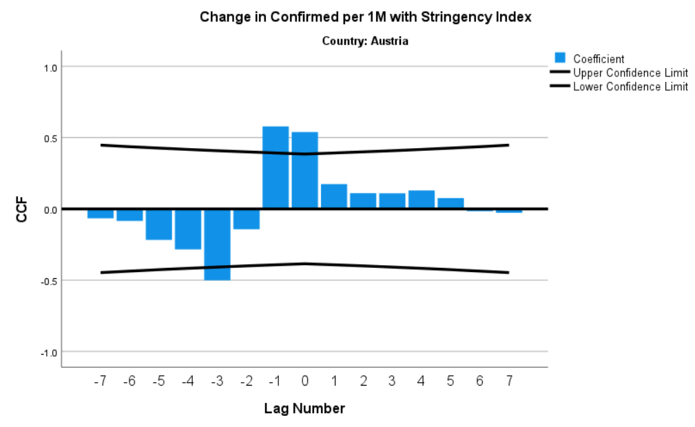
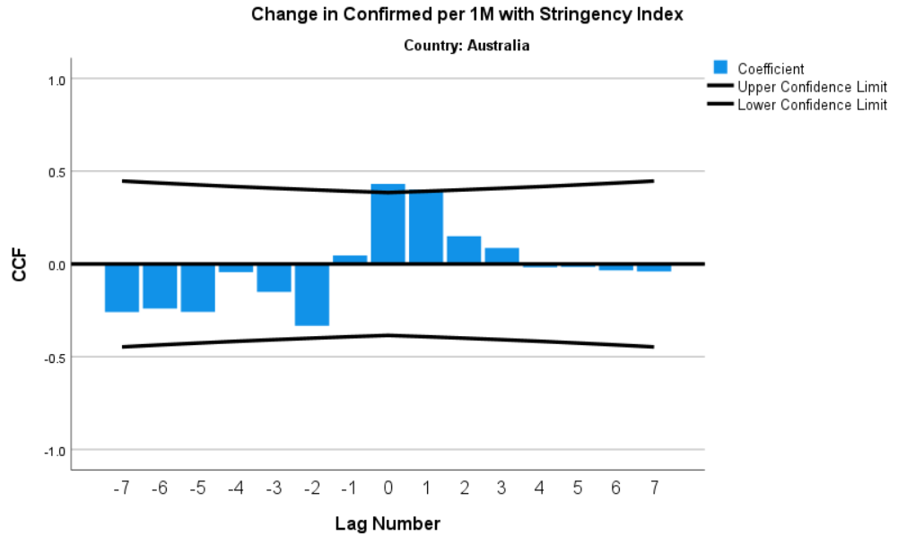
APPENDIX: Regression Output

Figure A.1: Linear Model of Q2 GDP Growth % (n = 38 countries)


Figure A.2: Linear Model of Q2 GDP Growth % (n = 50 U.S. states + D.C.)


Catholics and the Coronavirus

[Headline graphic: St. Gertrude Catholic Church (Chicago, Illinois), April 2020 (Photo by: Paul R. Burley; Used under the CCA-Share Alike 4.0 International license.)

Data used in this article can be found on GITHUB

By Kent R. Kroeger (Source: NuQum.com, October 14, 2020)

In August I posted an article discussing the importance of culture in modeling cross-national variation in coronavirus case and fatality rates. Its basic premise was that some cultures are more amenable to the individual-level behavioral changes (e.g., wearing masks and social distancing) needed to stunt the spread of the virus (i.e., East Asian collectivist cultures), while other cultures are more prone to spreading the virus (i.e., American individualism).

One reader suggested another culturally-based explanation for some of the cross-national variation in coronavirus cases, particularly among European nations: Catholicism.

My initial reaction was that the suggestion was plausible given that Belgium, France, Italy, Spain, and Mexico are majority-Catholic countries (see Figure 1) and were among the countries with the highest infection and deaths rates at that time.

Figure 1: Percentage of Catholics in European and other selected countries

Writing in early August, researchers at Georgetown University’s Center for Applied Research in the Apostolate (CARA) noted in their research blog:
“Looking globally at the most recent COVID-19 death rates per 100,000 population in countries with available data, it becomes apparent that some Catholic countries have been hit harder than others. As of yesterday, 17 countries had more than 30 deaths per 100,000 people. More than three in four of these countries have Catholic majority populations (as measured by the Annuarium Statisticum Ecclesiae and Pew Research Center estimates).
The only countries that are not majority Catholic in the 17 hardest hit are the United States (47.93 deaths per 100,000), the United Kingdom, Sweden, and the Netherlands. The latter two countries have not embraced masks and lockdowns as other countries have.”

But why would Catholic countries be more susceptible to the coronavirus? Catholicism is being confounded with more logical causal factors, I surmised. For example, Catholic-majority countries in Southern Europe are generally poorer than Northern European countries. It is also true that practicing Catholics tend to be older (a subgroup more vulnerable to the coronavirus) and have slightly larger household sizes; but, when I included country-level measures for GDP per capita, median age and average size of household in my statistical models, none came close to statistical significance.

I subsequently dismissed Catholicism as a likely factor in explaining the spread of the coronavirus, despite the prima facie evidence in its favor. [If 30 years of statistical modeling has taught me anything, don’t get too attached to seemingly plausible explanations and theories.]

However, a few days ago a former colleague sent of me a link to a 2016 study published by the Public Religion Research Institute (PRRI): Race, Religion, and Political Affiliation of Americans’ Core Social Networks, by Daniel Cox, Juhem Navarro-Rivera, and Robert P. Jones, Ph.D.

The study took an in-depth look at Americans’ closest personal relationships and found that the average American (n = 2,317) has 3.4 people in their close social network (see Figure 2), with Black protestants (n = 166) having the most (3.7 people) and the religiously unaffiliated having the least (3.2 people). Catholics (n = 502) reported 3.6 people in their close social network.

Figure 2: Social Network Sizes by Religious Affiliation (Source: PRRI)

More discriminating is the percentage of respondents with more than seven people in their close social network. Twenty-four percent of Catholics reported seven or more people in their social network, more than any other religious affiliation.

Coincidently, as I began to search for cross-national data on social network sizes (I found little), the Centers for Disease Control and Prevention (CDC) posted in its Morbidity and Mortality Weekly Report a case study about a family reunion in June-July 2020 where 20 family members from five households, including one teen exposed to SARS-CoV-2 prior to the reunion, spent three weeks at a vacation retreat.

Subsequently, 11 family members contracted the coronavirus.

“There is increasing evidence that children and adolescents can efficiently transmit SARS-CoV-2, the virus that causes coronavirus disease 2019 (COVID-19),” says the CDC report. “This investigation provides evidence of the benefit of physical distancing as a mitigation strategy to prevent SARS-CoV-2 transmission. None of the six family members who maintained outdoor physical distance without face masks during two visits to the family gathering developed symptoms.”

While these findings aren’t surprising, it highlights a possible causal mechanism for linking cultural characteristics prevalent among Catholic families with the spread of the coronavirus.

The Data

In studying the relationship of Catholic-majority countries to the spread of the coronavirus, I controlled for other factors that should correlate with cross-national differences:

I obtained data on the percentage of Catholics in 40 highly-developed countries from Catholic-Hierarchy.org (see Figure 1). For the summary measure of health care system quality I created an additive index based on three health care system components relevant to the treatment of COVID-19: (1) the number of nurses per 1,000 people, (2) the number of hospital bed per 1,000 people), and the percentage of the country’s population with medical insurance (public or private). All three health care sub-measures were converted to z-scores before creating the index score. The health care system quality index scores for each country can be seen in the Appendix (see Figure A.1).

Finally, the national-level suppression and mitigation policy daily index scores (Oxford’s Stringency Index) were averaged within each country over a period from January 20 to April 30, 2020. The intent was to assess whether stringent S&M policies early in the pandemic were effective in reducing the cumulative number of COVID-19 cases (as of October 11, 2020). The Stringency Index scores for each country can be seen in the Appendix (see Figure A.2).

The Linear Model

Figure 3 shows the linear model output for this four-variable model. All four variables were statistically significant and in the expected direction. National testing levels appear most strongly associated with the relative number of COVID-19 cases (i.e., more testing = more positive cases) with a standardized Beta coefficient (β) of 0.643, followed by stringency measures (β = -0.365), percentage Catholic (β = 0.312), and the health care system quality index (β = -0.273). [Given the small sample sample size (n = 40), take these differences in parameter estimates with a grain of salt.]

Overall, this simple, four-variable model explains almost two-thirds of the variance in COVID-19 cases per capita for the 40 countries in the sample.

Figure 3: Linear Model Predicting Number of COVID-19 Cases per 1M People for 40 Selected Countries (Regression model was weighted by population; Data sources: Johns Hopkins University – CSSE, Oxford University, OECD, Catholic-Hierarchy.org; Analytics by Kent R. Kroeger)

When we plot the 40 countries in our sample by their model prediction and actual values, some interesting outliers appear. Among those countries with relatively fewer COVID-19 cases per capita than predicted by the model, New Zealand, Hong Kong (not a country!), Iceland, Australia, Latvia, Lithuania, Denmark and Luxembourg stand out. Apparently, in controlling the coronavirus, it helps to either be a highly-controlled border (particularly an island) or a Baltic state.

On the not-so-good list–that is, more COVID-19 cases per capita than otherwise predicted by the model–are countries like Ukraine, Czechia, Israel and the U.S.

Figure 4: Predicted versus Actual Number of COVID-19 Cases per 1M People (Data sources: Johns Hopkins University – CSSE, Oxford University, OECD, Catholic-Hierarchy.org; Analytics by Kent R. Kroeger)

I admit that this model is too simple and static. In the real world, parameter estimates are themselves variable over time, not to mention that data quality (e.g., measurement error by a country’s statistical office) limits our ability to explain much of the nation-level variation.

Variables that once had a strong relationship in my early models of the coronavirus (namely, population density), have ceased to show statistical significance. Likewise, S&M policies that were once insignificant or significant in an unexpected direction (e.g., lockdown policies), now appear significant in the expected direction. According to this latest model, stringent suppression and mitigation measures work when they are adopted early in a pandemic.

Still, there are countries like Japan that have not enforced draconian S&M measures, yet have effectively controlled the spread of the coronavirus.

Culture matters, such that, in the cases of Japan and South Korea, whose histories include significant periods of authoritarian rule, citizens appear much more compliant with strict coronavirus measures regarding the wearing of masks and social distancing. In contrast is the United States where a significant percentage of the population puts a high premium on individualism and personal freedom.

There is no simple policy solution for this virus, but there is concrete evidence that culture is a significant factor in explaining how well nations are handling the pandemic. Culture can either work with for or against national efforts to control this virus.

In the above model, countries with a higher percentage of Catholics have, all else equal, a relatively higher level of coronavirus cases. I suspect this statistical relationship is driven by Catholicism’s generally larger, closer family networks. But I’m using aggregate data to explain nation-level outcomes. To understand what is really going within Catholic populations and the coronavirus, individual-level data is needed.

Furthermore, there is anecdotal evidence that religion affiliations other than Catholicism are significant factors in other countries with respect to the coronavirus. In Israel, a significant number of COVID-19 cases can be linked to the ultra-Orthodox Hasidic community’s participation in large-group religious activities. Similar religious activities in the U.S. have also been linked to cluster outbreaks of COVID-19, including a Houston, Texas Catholic Church which experienced a major cluster outbreak of COVID-19.

Is it large, tightly-knit social networks or large-group gatherings driving a seemingly a high incidence rate of coronavirus cases in countries with large Catholic populations?

Or perhaps singling out Catholicism altogether, as I’ve done here, is a mistake? Maybe it is something about groups of people congregating for any reason that is the true causal factor at play? [Who in the hell in Texas thought filling up Kyle Field stadium with 24,700 fans at the Texas A&M-Florida game last weekend was a good idea?]

What is irrefutable in my view is that there is no threat to humans more addressable at the individual-level than a viral pandemic.

Wash your hands. Wear a mask. And keep your distance.

How hard is that? It shouldn’t take a president (or any leader) setting a good example to inspire such simple and effective behavior by a country’s citizens. The end of this pandemic is in our own hands.

  • K.R.K.

Send comments to: nuqum@protonmail.com
or DM me on Twitter at: @KRobertKroeger1


APPENDIX:

Figure A.1: Health Care System Quality Index


Figure A.2: Stringency Index (Daily Avg. from January 20 to April 30, 2020)


The Democrats and GOP ignore America’s massive political center at their own risk

(Headline graphic by Sagearbor; used under the CCA-Share Alike 4.0 International license.)

By Kent R. Kroeger (Source: NuQum.com; October 9, 2020)

Why is it that the two major U.S. political parties (but particularly the Democrats) make little effort to attract voters who are, for various reasons, detached from the two-party system?

Loosely called the ‘political center,’ when they do get attention it is mostly from academics who divide them up into “independents,” “undecideds,” and ideological “centrists,” and generally dismiss them as less-informed and prone to emotional  appeals from politicians.

Occasionally, a political campaign will spend some of its finite campaign funds on attracting “centrist” voters; but, for the most part, the modern U.S. political campaign today spends the vast majority of its money on rallying their partisans and getting them to vote.

But why so little attention to a political center that is presumably capable of changing the outcome in a tight election?

According to many in the political and media establishment, the reason is simple: There is no political center in the U.S. anymore. Eligible voters are either Democrats or Republicans, even if they don’t categorize themselves as such. And those who don’t fit neatly into the GOP vs. Democrat box are essentially irrelevant.

In October 2015, The New Yorker‘s Ryan Lizza  offered this analysis: “The center is dead in American politics.”

Two years later, New York Magazine’s Eric Levitz shared a similar epiphany with readers: “The Democrats can abandon the center—because the center doesn’t exist.”

If two New York-based writers can’t convince you that the political center is irrelevant, let New York-based data guru Lee Drutman take a stab:

“Stop me if you’ve heard this one before: Independent voters will decide the election. Or better yet: Moderate voters will decide the election. Or, wait for it … If Democrats can move to the middle, they will win in 2020.

These tropes conjure up a particular image: a pivotal bloc of reasonable “independent” voters sick of the two major parties, just waiting for a centrist candidate to embrace a “moderate” policy vision. And there’s a reason this perception exits: You see just that if you look only at topline polling numbers, which show 40-plus percent of voters refusing to identify with a party, or close to 40 percent of voters calling themselves moderates.1 But topline polling numbers mask an underlying diversity of political thought that is far more complicated.

Moderate, independent and undecided voters are not the same, and none of these groups are reliably centrist. They are ideologically diverse, so there is no simple policy solution that will appeal to all of them.”

Drutman’s data-driven argument is thick with condescension and contempt for segments of U.S. society (moderates, independents and undecided voters) for which he offers one insightful observation: “None of these groups are reliably centrist.”

Drutman’s observations, however, are not novel. Political scientists have been marginalizing the political center for over 60 years, starting with the seminal work, The American Voter, and reinforced more recently by Christopher Achen and Larry Bartels in their 2016 book,  Democracy for Realists: Why Elections Do Not Produce Responsive Government, in which they concluded the electorate neither understands nor particularly cares about policy, but instead are motivated by their group identities when making political choices.

“Most democratic citizens are uninterested in politics, poorly informed, and unwilling or unable to convey coherent policy preferences through ‘issue voting,'” write Achen and Bartels. “Voters, even the most informed voters, typically make choices not on the basis of policy preferences or ideology, but on the basis of who they are—their social identities.”

In summarizing  Achen and Bartel’s work, journalist Noah Berlatsky  concluded, “Voters’ policy choices typically demonstrate not thoughtful centrism, but galumphing ignorance and indifference.”

What is clear from the work of Drutman, Achen, Bartels and other political scientists, they have never worked in a competitive consumer environment. If a data analyst ever came to me and said, “We can’t build our customer base because our non-customers are too diverse and unpredictable,” that person would be re-assigned to accounting.

What political scientists are basically saying is that there is no policy solution to attract disengaged voters that fit their notion of what defines the political left and right.

As I will show below—and as Drutman actually finds but does not acknowledge in his own analysis–there is a large segment of the U.S. vote-eligible population with policy preferences out of alignment with elite assumptions on how someone’s policy views should relate to their self-ascribed ideology and partisanship.

For example, there are registered Democrats who are pro-gun control yet support strictly limiting immigration into the U.S; just as there are registered Republicans who are skeptical about the importance of climate change, but support increasing taxes on the wealthy. There is no stone tablet that says someone on the political left (or right) cannot be pro-life and also a strong supporter of Medicare-for-All.

Not only do people with hard to categorize opinions exist, there are a lot of them. And many of them vote—though not to the degree as strong partisans. Therefore, they may be an expensive vote to capture, but given their numbers, they may well be worth the effort.

When Drutman and his Manhattan happy hour companions dismiss the ideological inconsistencies of the political center, they are in fact describing and enforcing the artifice of a political system designed to marginalize a significant percentage of Americans.

Through their personal, day-to-day interactions with friends and family, as well as their regular diet of mainstream news, Americans have come to believe some issue positions are inherently incompatible with correct-thinking liberals or conservatives.

It’s a self-reinforcing feedback loop that serves the two major political parties and their corporate patrons very well. What better way to guarantee the American voter will only support one of the two establishment parties than to make the average American think there are only two rational choices on Election Day.

In reality, there is a significant percentage of Americans largely disconnected from the dominant narrative driving today’s political discussion about political ideology, partisanship and policy.

So why are so many in the national media so determined to convince Americans that the U.S. no longer has a political center?

Perhaps the Chinese philosopher Lao Tzu offers a clue:

“If you search everywhere, yet cannot find what you are seeking, it is because what you seek is already in your possession.”

I prefer the axiom’s complement, first articulated in my recollection by Sherlock Holmes:

“You can’t find what you aren’t looking for.”

An apparent consensus of political and media elites conclude that the political center doesn’t exist in the U.S. because they simply aren’t looking for it.

When one actually looks at the data, however, a large and politically relevant political center is impossible to miss.

The Data

For the following charts, I analyzed the American National Election Studies (ANES) 2019 Pilot Study, an internet-based survey of 3.000 U.S. adults conducted by YouGov.com from December 20-31, 2018. The data for the charts below are weighted to match national characteristics on gender, age, race/ethnicity, education, geographic region, and presidential candidate choice.

This survey, now over one year old, was chosen for its public availability and the wide range of policy questions it asked respondents in the month after our last nationwide election.

The Results

To facilitate this data presentation, I segmented the U.S. adult population into six policy clusters based on 43 attitudinal and policy-related questions in the ANES 2019 Pilot study and sorted these segments based on their relationship to respondents’ self-described ideology (see Figures 1a and 1b below). The policy clusters are as follows (from most supportive of Trump to least): Strong Conservative, Moderate Conservative, Center-Right, Center-Left, Moderate Liberal, and Strong Liberal.

The attitudinal and policy items used for the cluster analysis are listed in Appendix A below.

While my naming convention confounds the two distinct concepts of partisanship (Republican-Democrat) and ideology (Conservative-Liberal), it is important to emphasize that this attitudinal segmentation is based solely on policy attitudes and opinions.

Figure 1a: The Six Policy Clusters

Figure 1b: The Six Policy Clusters by Self-described Ideology

In December 2018, a month after the Democrats regained the U.S. House in the midterm elections, strong and moderate liberals far outnumbered strong and moderate conservatives (40 percent to 27 percent, respectively). The largest policy clusters were the Center-Left (22%, 50.6 million people) and Strong Liberal (21%. 48.3 million people) segments, and the smallest were the Strong Conservative (14%, 32.2 million people), Moderate Conservative (13%, 29.9 million people), and the Center-Right (11%, 25.3 million people).

The center of American politics may contain 76 million Americans. Even if only 40 percent vote (as in 2016), that represents about 30 million people.

Figure 2: The Six Policy Clusters by 2016 Presidential Vote Choice

Figure 2 (above) vividly shows why Hillary Clinton lost to Donald Trump. Though her policy-related base was probably larger than Trump’s at the time, she was unable to keep their loyalty. Only 79 percent of Strong Liberals voted for Clinton compared to the 94 percent of Strong Conservatives who voted for Trump. A similar picture emerges with Moderate Liberals and Moderate Conservatives.

More interesting, perhaps, is what happened with those Americans with hard to categorize policy views (i.e., Center-Right and Center-Left).  The majority of both segments voted, but while the Center-Left was evenly divided between Trump and Clinton, the Center-Right decisively preferred Trump over Clinton (36% to 24%, respectively).

If we account for the different sizes of these six policy clusters, we can infer from Figure 3 that there were enough Trump voters among the Center-Left that had Clinton persuaded one-sixth of them to vote for her instead of Trump, she would have gained around 2 million additional votes.

Remember she lost the Electoral College by around 70,000 votes in a handful of key states (MI, PA, WI).

Figure 3: The Size of the Six Policy Clusters and their 2016 Presidential Vote Choice

While many factors in 2016 assembled to create the perfect anti-Clinton storm, a contributing ingredient was her inability, in contrast to Trump, to attract voters in the political center.

Clinton’s failure is evident in the volumes implied in Figure 3:

  • Around 2 million Moderate Liberals voted for Trump.
  • Around 14 million Center-Left voters voted for Trump.
  • Around 4 million Moderate Liberals voted Third Party.
  • Around 4 million Strong Liberals voted Third Party.

Who is in the political center?

As Drutman found, categorizing the political center is not easy. They are a motley blend of various social backgrounds and attitudes. The center is far from homogeneous. But, according to data from the ANES 2019 Pilot Study, centrists do stand out from the other policy clusters across a number of key demographic measures.

Compared to the other policy segments, the two center clusters are younger, more female, less educated, and living in lower-income households (see Appendix B below for the detailed demographic charts).

The two center clusters do, however, differ substantially from each other on race/ethnic composition (see Figure 4). Fifty-five percent of Center-Left members are non-white, compared to only 23 percent of the Center-Right.

Figure 4: The Six Policy Clusters by Race/Ethnicity

The Center-Left is racially and ethnically diverse, and the Center-Right much less so (though the Center-Right is the most diverse of the three right-of-center clusters).

Notable also is that the three left-of-center clusters are substantially more diverse in terms of race/ethnicity than the three right-of-center clusters. There should be no doubt among political operatives that the growing racial/ethnic diversity of the American population currently works in the favor of the Democratic Party. But, as I will show next, that conclusion must include a recognition that there are policy issues—should they become election drivers—that could driver Center-Right voters to the left and, vice versa, drive Center-Left voters to the right.

The Democrats have been ceding the Center to the GOP

Arguably, at least since the 1990s, establishment leaders for both the Democrats and Republicans have eschewed compromise on their party’s core issues. For the Democrats, no issue is as central to the party’s ideology as abortion rights.

Prior to the 2016 campaign, Democratic Party platforms and presidential candidates had generally argued for making abortions “safe, legal, and rare.” With the 2016 and 2020 campaigns, however, the Democratic Party platform dropped that rhetorical pretense and opted, instead, for an uncompromising view of abortion rights:

Democrats believe that every woman should be able to access high-quality reproductive health care services, including safe and legal abortion…

…Democrats oppose and will fight to overturn federal and state laws that create barriers to women’s reproductive health and rights. We will repeal the Hyde Amendment, and protect and codify Roe v. Wade.

In practical terms, the national Democrats believe an abortion should face restrictions no greater than that for getting a tooth pulled. The national Republicans, for their part, have been consistently anti-abortion since the Supreme Court’s 1973 Roe v Wade ruling.

As for the Republicans, among their ideological blind spots, no issue activates their lizard brain faster than the concept of universal, single-payer health care.

‘Socialized medicine!’ the GOP cries anytime even modest health care reform measures–such as Obamacare–are considered in Congress. Obamacare–a reform whose core idea is to unleash the IRS on Americans who refuse to buy health insurance–is to ‘socialized medicine’ what former New Jersey Governor Chris Christie is to Olympic pole vaulting.

Given how polarized party leaders are on these two issues–abortion and universal health care–it is surprising the Democrats are choosing to ignore a large number of people they may be losing at election time because they are not consistently marketing their candidates to the political center.

For example, the 2016 Clinton campaign may have lost two million potential votes for failing to appeal more aggressively to Center-Right voters on abortion rights. According to data from the ANES 2019 Pilot Study, 33 percent of Center-Right say they would be at least “moderately upset” if abortion restrictions were increased (see Figure 5). That translates to 8.3 million people in a segment where only 6.1 million voted for Clinton in 2016.

Figure 5: The Six Policy Clusters by Attitudes Towards Abortion Restrictions

The Democrats make a similar mistake with the political center on universal health care (e.g., Bernie Sanders’ Medicare-for-All proposal). Thirty-two percent (i.e., over 8 million) Center-Right Americans at least moderately support Medicare-for-All (see Figure 5). That’s a higher level of support than among Center-Left Americans.

Figure 6: The Six Policy Clusters by Attitudes Towards Medicare-for-All

But wouldn’t a Medicare-for-All appeal by the Democrats turn off some of their core supporters? Of course that is the risk–which is why  persuasion still matters in American campaigns. Sometimes, to win elections, candidates need to lead their base as they try to expand their electoral coalition beyond their base.

It’s called strategic adjustment.

Given that health care is perennially among the most important issues to voters at election time, consider the vote potential squandered by the Democrats when they spend more time defending private health insurers and pharmaceutical companies than advocating for guaranteed, affordable universal health care. According to the ANES 2019 Pilot Study data, 48 percent of Center-Right Americans are at least “very” concerned about future medical expenses–the highest level of any of the six policy clusters (see Figure 7).

Figure 7: The Six Policy Clusters by Fear of Medical Expenses

And, conversely, the Republicans jeopardize their own electoral competitiveness when the continue to oppose universal health care proposals favored by almost half of Center-Right Americans.

Final Thoughts

Let me preface my last comments on the American political center by emphasizing what is NOT meant by “making appeals to the political center.”

Centrist voters are not necessarily attracted to centrist candidates or ideas. Quite the opposite, the research suggests they are more motivated by emotional appeals than specific policy ideas; such that, namby-pamby, wishy-washy “middle-of-the-road” rhetoric is not the optimal path for gaining centrist support.

That psychological reality, however, has not produced policy outcomes in the best interests of most voters, according to Achen and Bartels.

But their conclusion is just a sophisticated, data-driven form of  ‘victim-blaming.’

Ideologically hard-to-classify Americans (“centrists”) aren’t intellectually lazy, they just have more important things to worry about than partisan politics—things like affordable health care, housing, and education, etc.

It is not surprising to me that political strategists and pundits find centrists frustrating. They don’t fit it neat little boxes, which is why Get-Out-The-Vote (GOTV) tactics are far more appealing to them than any meaningful efforts at persuasion.

Unfortunately, the fundamental mistake political strategists make when they advocate for GOTV strategies at the expense of appeals to the political center is the assumption that voters can be owned by a political party more easily than they can be persuaded.

It is a recipe for disaster, for it also assumes political parties and campaigns are static, non-strategic actors.

If the 2016 presidential campaign taught us anything, it is that parties and candidates can make substantive and abrupt strategic adjustments for a net political gain (Trump’s call in the 2016 election for renegotiating international trade agreements, closing down tax loopholes for hedge fund managers and ending America’s forever-wars are prime examples of this type of ideological flexibility). [Yes, I know Trump failed spectacularly on two of those promises, and it may cost him dearly in the 2020 election.]

The Democrats may not own the African-American or Hispanic vote going forward. Its a dangerous assumption that, while not likely to backfire in 2020, could easily do so in subsequent elections, especially if the GOP can demonstrate the level of ideological flexibility our current president did in 2016.

Ignoring the America’s political center is always a bad idea.

  • K.R.K.

Send comments to: nuqum@protonmail.com
or DM me on Twitter at: @KRobertKroeger1

APPENDIX A:

Attitudinal and Policy Items used for Cluster Analysis

APPENDIX B:

Demographic Characteristics of Policy Segments

It should be noted that probability-based margin of error calculations with the ANES 2019 Pilot Study are not applicable given the non-probability sampling methods used to recruit the YouGov national online panel. If YouGov’s online panel had been selected on a probability basis, the effective sample size in the ANES 2019 Pilot Study (n = 2,453) would have a margin of error of ±2 percentage points at the total sample level.

The two center policy clusters skew more female than the other policy clusters. Sixty percent of U.S. adults in the Center-Right are female, compared to just 36 percent within the Strong Conservative cluster and 47 percent within the Moderate Conservative cluster (see Figure B.1).

Figure B.1: The Six Policy Clusters by Sex

The two center clusters are more similar to the Strong and Moderate Liberal clusters in terms of average age, with members of the Center-Left being particularly young at an average age of 39 years old (see Figure B.2). Not surprisingly, the two most conservative clusters are also the oldest.

Figure B.2: The Six Policy Clusters by Age Groups

The wealthiest clusters are the Strong and Moderate Conservative clusters, both averaging over $80,000 annually for family incomes (see Figure B.3). Conversely, Center-Right and Center-Left clusters have the lowest annual family incomes ($42,995 and $46,078, respectively).

Figure B.3: The Six Policy Clusters by Annual Family Income

As seen in Figure B.4, the Strong Liberal cluster is more educated (45% with at least a 4-year college degree), followed by Moderate Conservatives (35%), Moderate Liberals (33%) and Strong Conservatives (24%). Less than 20 percent of members in the two center clusters have at least a 4-year college degree.

Figure B.4: The Six Policy Clusters by Education

While the two center clusters are similar in age, gender, education and income, they differ in their race/ethnicity composition (see Figure B.5). Over 50 percent of Center-Left members are non-white, compared to only 22 percent of Center-Right members. The least diverse clusters are the Strong Conservatives and Moderate Conservatives (17% and 15% non-white, respectively).

Figure B.5: The Six Policy Clusters by Race/Ethnicity Categories

Ballot harvesting threatens the integrity of our democracy

By Kent R. Kroeger (Source: NuQum.com; September 27, 2020)

What is it about Democratic congresswoman Tulsi Gabbard (D-HI) that compels her to call out her own party every time it appears hypocritical?

In the age of #MeToo, America’s homodox-class in the news media saw no contradiction in cheering the French film “Cuties” for its vivid exploration into the sexual awareness of young girls growing up in today’s over-sexualized, social-media-driven culture. Alone among her liberal and progressive colleagues, Gabbard has been the only Democrat to point out that the making of “Cuties” involved adults coaching underage girls how to simulate sexual acts on stage. Though many think the film is a powerful critique of today’s over-sexualized society and its impact on children, other thoughtful people believe the film fits the definition of child pornography.

Predictably, Gabbard was accused by some in the mainstream media of being aligned with QAnon-sourced conspiracy theories. Smears and name-calling are the go-to-move for today’s media and political elites.

So what is Gabbard’s next move? Attacking the Democratic Party’s current sacred cow: ballot harvesting.

‘What could be wrong with ballot harvesting?” you ask, particularly at a time when a worldwide pandemic makes any kind of mass, in-person activity — like voting at your local polling station — a threat to one’s health.

Isn’t ballot harvesting just a fast and efficient way to collect absentee (mail-in) ballots?

Gabbard’s answer is not what Democrats want to hear.

“Nothing is wrong with absentee or mail-in voting,” says Gabbard. But underneath the Democrats’ push for mail-in voting for this upcoming election is pressure for states to allow ballot harvesting.

What could be wrong with something sounding so wholesome that it requires harvesting? Is Gabbard against corn and Halloween pumpkins too?

Of course not. Rather, Gabbard believes ballot harvesting threatens the fundamental integrity of our democratic system because it allows for third parties to collect and deliver voter ballots to the state agencies responsible for counting votes.

Unlike in-person and absentee voting, ballot harvesting puts someone between an eligible voter and their vote.

So what is wrong with third parties being involved in the process?

Pretty much everything.

Here is Gabbard’s view on ballot harvesting and the role of third parties in the electoral process:

According to Gabbard: “The strength of our democracy lies in the integrity of our elections that every one of us has to have faith that our vote will count. But right now there are still many states in our country that allow for something called ballot harvesting. This is a system that allows for third parties to collect and deliver ballots for other people, potentially large numbers of people. Unfortunately, ballot harvesting has allowed for fraud and abuse to occur by those who could tamper with or discard ballots to try to sway an election for or against a certain candidate or party.”

Gabbard continues…

“Our vote is our voice, so whether in the midst of a pandemic, as we are now where mail-in-voting is likely to drastically increase, no one should get in between a voter in the ballot box. And while some states have prohibited
vote harvesting or ballot harvesting, many have not — which again allows for
abuse from third parties collecting and mishandling ballots. This is something that we’ve actually seen happen in recent elections.”

In response to the drive to make mail-in-voting the norm for the 2020 national election, Gabbard and Congressman Rodney Davis (R-IL), have introduced a bill in Congress (H.R.8285) that will “protect the chain of custody for every one of our ballots by prohibiting funding from going to States that allow ballot harvesting to occur.”

For the most part, Democratic Party leaders and their media surrogates have ignored Gabbard’s latest fusilade against party orthodoxy, but the fact remains serious questions remain if ballot harvesting is allowed to persist going into the current election.

Ballot harvesting goes beyond the normal absentee voting process. In 27 states and Washington, D.C., it’s legal for residents to allow a non-family member to mail in or drop off their ballot, according to policies tracked by the National Conference of State Legislatures.

Ballot harvesting and absentee voting are not the same thing, yet they are routinely confounded in the media.

Absentee voting does not put a third party between your vote and its official tally (through state-run election boards), while ballot harvesting does.

What could go wrong if the Democrats get ballot harvesting allowed across the country?

Leave it to a crooked Republican operative to provide the answer.

In 2016, a Republican operative used ballot harvesting to help turn a congressional election in favor of a Republican candidate.

A coordinated, unlawful ballot harvesting scheme operated in the 2018 general election in rural Bladen and Robeson counties in North Carolina’s 9th congressional district, most likely, changed the outcome of an election.

At a basic level, what happened in North Carolina’s 9th congressional district was as follows:

Leslie McCrae Dowless Jr., a political operative paid by Republican congressional candidate Mark Harris, paid local people $125 for every 50 mail-in ballots they collected in Bladen and Robeson counties. That means they could have been altered before being counted — which is what appears to have happened. Democrat votes were most likely illegally discarded through the ballot harvesting system.

This is what fraud looks like when performed by someone with no understanding on how to avoid looking like a fraud.

Its vote fraud by those who know how to avoid looking like frauds that I most fear.

In the end, the congressional election in North Carolina’s 9th district had to be re-competed, but the lesson was clear: ballot harvesting is prone to fraud.

Fast forward to 2020 and the question of ballot harvesting is largely dismissed by the media and academics.

“The evidence presented does not make the case that voter fraud is a major problem in America,” concludes Elaine Kamarck and Christine Stengleinfrom the Brookings Institute.

The research says all forms of voter fraud are extremely rare.

Yet, in fact, in addition to the North Carolina case, there is concrete evidence from the past that ballot harvesting has resulted in, at at a minimum, questionable activities.

“People were carrying in stacks of 100 and 200 (ballots). We had had multiple people calling to ask if these people were allowed to do this,” said Neal Kelley, the registrar for voters in Southern California’s Orange County.

Who were the “multiple people”?

Political operatives.

If you are like me, you’d trust “political operatives” with your life and the life of your children.

But do you trust them with our electoral process?

In 2016, California Gov. Jerry Brown signed AB1921, a California law which legalized ballot harvesting. Prior to that law, only a family member or someone living in the same household was permitted to drop off mail ballots for a voter. But under but the new law, anyone — including political operatives — are allowed to collect and return ballots.

What could go wrong?

Failure to deliver ballots in a timely manner is probably where ballot harvesting is most vulnerable to vote fraud.

In the 2020 primary, 70,330 mail-in ballots were rejected by California election officials during the March presidential primary because they were not postmarked on or before Election Day, according to the California Secretary of State.

Based on what we’ve seen in practice, ballot harvesting invariably includes cases where some ballots are delivered too late to be counted. But suppose this tardiness has a systematic (even if inadvertent) bias favoring one party over another? Worse yet, suppose a ballot harvester decides to slow-walk completed ballots from households perceived to be hostile to their preferred candidate or party?

As Gabbard points out, once a state puts third parties between the voter and the vote tallying process, the possibility of fraud grows considerably.

The direct manipulation of a ballot is not as likely an avenue for vote fraud, but hard to dismiss as a possibility.

More than 1,000 ballots were disqualified in Fresno County because the signature didn’t match the one on file with election officials. The same problem nixed over 1,300 ballots in San Diego County — and over 14,000 statewide. In some of those cases, voting experts say, a family member might have signed for others in the household, which is illegal.

In California (as in every other U.S. state), it is a felony for anyone to tamper with a ballot, which is why election officials check the signature on all mail-in ballots against the voter’s signature on record.

In some states allowing ballot harvesting, official ballots are mailed proactively to addresses known to have had eligible voters, but there is no guarantee the voter still lives there.

In cases where the voter has moved or doesn’t receive their mail directly, someone besides the voter could possess their official ballot.

Again, there is no existing evidence of systematic ballot fraud in such cases, but the possibility cannot be ignored, particularly if this method for delivering ballots becomes industrialized on a national scale.

Long delays in election outcomes will erode our nation’s already declining confidence in vote results.

Similar to what happened in California’s 2020 primary, in a New York congressional primary, election officials discarded thousands of ballots for lack of postmarks. The election result was not certified until six weeks after the election. Were the discarded ballots random or systematic? Don’t ask the State of New York, they’d rather not know.

Arizona’s 2018 senatorial election took weeks after Election Day to determine the outcome. And why? Apparently, Arizonans like to vote early, by mail, and that requires significantly more work for Arizona elections officials.

Arizona state law requires a mail-in ballot to be sealed and signed, and elections officials must match each signature to the one on file with the voter’s registration before even opening the envelope.

In 2018, that meant 1.7 million individual signatures that had to be confirmed by hand.

This tedious process is exacerbated in the final days of an election when mail-in ballots flood a state’s election officials, who on election day are dealing with the significant complexities of in-person voting.

Was the delay in the 2018 election indicative of an illegitimate election in Arizona? No, but did it invite multiple conspiracy theories suggesting as much? An undeniable, ‘Yes.’

And it is in that operational space where our democracy erodes with ballot harvesting.

Are there potential benefits to ballot harvesting?

Certainly, yes.

The 2018 midterm election was the first California election where the state’s Democratic party fully capitalized on ballot harvesting, which had been legalized in 2016.

As seen in Figure 1—which shows the change in California eligible voter turnout by county racial composition (i.e., % of county population that considers themselves ‘white only,’ according to the 2010 U.S. Census) — in California counties under 55 percent white, voter turnout increased between the 2014 and 2018 midterm elections by 18.7 percentage-points, compared to only 13.2 percentage-points for counties over 85 percent white.

Figure 1: Change in California Eligible Turnout by County Racial Composition (Source: California Secretary of State)

Image for post

This turnout increase cannot necessarily be attributed to ballot harvesting, as the numbers in Figure 1 are based on aggregate, county-level data. Furthermore, the turnout increases in California’s least-white counties were also a function of non-white voters being much more energized than white voters. Call it the Trump Effect if you will, but there is little argument that the Trump presidency, independent of loosened mail-in ballot procedures, drove a lot of Americans to the polls, many of whom wouldn’t have voted otherwise.

Still, according to a U.S. Census report the nationwide turnout increase for Hispanic and Black voters in 2018 was between 10.8 and 13.4 percentage-points over 2014. The significantly higher turnout increases in California’s least-white counties encourage fair speculation that ballot harvesting may have partially been responsible for those higher numbers.

The same U.S. Census report points out that non-Hispanic whites still turnout to vote at a higher rate than non-Hispanic Blacks, non-Hispanic Asians, and Hispanics (57.5%, 51.4%. 40.2%, and 40.4%, respectively).

Any improvement to our voting process that narrows racial and ethnic vote turnout gaps is a good thing. But there are better ways to increase voter turnout than ballot harvesting, which creates a security vulnerability that can’t be brushed off as a ‘conspiracy theory’ or ‘fake news.’

Journalists and political analysts at major media outlets — such as MSNBC, CNN, Slate.com and Politico.com — continue to say there is ‘zero evidence’ of vote fraud related to ballot harvesting, but that assertion is itself demonstrably false. Besides, within any system where a potential vulnerability is identified, waiting for the vulnerability to be exploited before addressing the problem is not good systems management. In fact, its a recipe for disaster.

And that is what could happen if ballot harvesting becomes a national norm for our future elections.

Tulsi is right again.

  • K.R.K.

Send comments to: nuqum@protonmail.com
or DM me on Twitter at: @KRobertKroeger1

Are China and Russia moving too fast on a coronavirus vaccine?

[Above graphic is a combined image from a 3D medical animation, depicting the shape of the coronavirus as well as the cross-sectional view. Image shows the major elements including the Spike S protein, HE protein, viral envelope, and helical RNA (Image by https://www.scientificanimations.com; used under the Creative Commons Attribution-Share Alike 4.0 International license.]

By Kent R. Kroeger (Source: NuQum.com, September 22, 2020)

In May, the University of Minnesota’s Center for Infectious Disease Research and Policy (CIDRAP) — one of the world’s leading research centers on infectious diseases — issued a warning about any expectations of a coronavirus vaccine being available soon or 100 percent effective once available.

Among CIDRAP’s recommendations for policymakers were these two warnings:

States, territories, and tribal health authorities should plan for the worst-case scenario, including no vaccine availability or herd immunity.

Risk communication messaging from government officials should incorporate the concept that this pandemic will not be over soon and that people need to be prepared for possible periodic resurgences of disease over the next 2 years.

Five months later, their cautious words remain relevant.

While the world may be closer than ever to its first regulatory-approved coronavirus vaccine — at least nine vaccines are already in Stage 3 testing — there is a concern among scientists that this first vaccine may not be effective enough to achieve herd immunity (estimated to be around 60 to 70 percent of a population) and could discourage the development of significantly better alternatives.

This month, China announced it has started to deploy two state-approved coronavirus vaccines— both developed by Sinopharm, a state-owned pharmaceutical company — and has already vaccinated over 100,000 people.

Remarkable is that China is doing this while still in Phase 3 trials for the vaccines (see Figure 1 below for a description of the five stages/phases in vaccine development).

In addition to China, Russia has also approved a new coronavirus vaccine.

Scientists outside of China are predictably concerned and skeptical of China’s aggressive vaccine rollout.

“One needs to carefully conduct clinical trials of adequate size with adequate time for follow-up, look at both efficacy and safety, and those data have to be very carefully reviewed before you start giving the vaccine to people outside of a carefully designed clinical trial,” Daniel Salmon, director of the Institute for Vaccine Safety at Johns Hopkins, told Vox’s Lili Pike.

Phase 3 trials are critical as they involve around 30,000 test subjects and are designed to reveal rare, adverse reactions to test vaccines. For example, if just 1 out of 30,000 vaccine recipients (0.33 percent) has a fatal reaction to an otherwise highly-effective vaccine (say, 90%), that could translate into 260,000 vaccine-related deaths if the vaccine were given to the entire world population.

Figure 1: The 5 Stages of Vaccine Development

Image for post

Image courtesy of Wellcome Trust

However, John Moore, an immunologist at Weill Cornell Medical College, believes China, given its current low infection rates, could afford to wait until Phase 3 trials are completed in order ensure a safe and effective vaccine.

But Moore’s calculus ignores a more powerful dynamic behind China (and Russia) aggressively rolling out coronavirus vaccines far ahead of standard practice in new vaccine development, which typically takes around 10 years.

The fastest development ever was for the mumps vaccine which took four years from start to final regulatory approval.

The economies of China and Russia have been deeply hurt by the coronavirus pandemic (as have all world economies) and there is a strong incentive to end this pandemic as soon as possible — even at the risk of exposing their own citizens to potentially unsafe or ineffective vaccines. The cost-benefit analysis in autocratic societies is fundamentally different than in capitalist democracies such as in the U.S. and European countries.

If China and/or Russia are successful with their early vaccine deployments, they will become the model example for future Lean Six Sigma workshops.

Somehow China and Russia have done in seven months what typically take seven years.

A Half-Baked Cost-Benefit Analysis

The following cost-benefit analysis is meant merely as a thought experiment and is not a formal exercise in risk management. However, it is intended to loosely approximate the analyses underlying the decision by the Chinese and Russians governments to accelerate their vaccine developments.

In the following analysis of an hypothetical early rollout vaccine, these assumptions were used:

  • The coronavirus infection fatality ratio equals 0.0084, the most recent CDC estimate (i.e., 0.84 percent of those who contract the virus will die).
  • All world citizens (7.8 billion) are vaccinated by the early rollout vaccine and at roughly the same time.
  • The early rollout vaccine has a fatality ratio of 0.0033 (i.e., 0.33 percent) — an extremely high ratio that would never be approved by a U.S. or European regulatory body.
  • Calculations of total coronavirus deaths (coronavirus deaths + vaccine deaths) are based on a vaccine effectiveness rates of 40%, 60%, 80%, and 90%. (Note: Most vaccines are between 85 and 95 percent effective, according to OurWorldInData.org)
  • A coronavirus-related estimate of worldwide deaths assumes everyone is either effectively vaccinated or ineffectively vaccinated. Among those ineffectively vaccinated, they will either die from the vaccination or contract the virus. Those with highly-adverse reactions to the vaccine are rolled into the vaccine fatality rate.
  • If no vaccine is ever developed, everyone contracts the virus at roughly the same point in time.
  • This analysis ignores retransmission.

Figure 2 shows the estimated total number of coronavirus-related worldwide deaths for each vaccine effectiveness rate. It is important to note that this is a near worst-case scenario in terms of the vaccine fatality rate (VFR). A vaccine with a VFR of 0.0033 would never be approved by regulators. In the real world, due to strict development requirements, vaccines are extremely safe and this hypothetical cost-benefit analysis is not meant to challenge that scientifically-supported fact.

Figure 2: Hypothetical Cost-Benefit Analysis of Early Rollout Vaccine

Image for post

Nonetheless, an analysis like the one in Figure 2 is being done across the dozens of pharmaceutical and research institutes working on a coronavirus vaccine right now.

Given that many epidemiologists are estimating that the herd immunity rate for the coronavirus is probably between 60 and 70 percent, a vaccine effectiveness rate less than that might not halt the epidemic.

But as Figure 2 shows, in a near worst-case scenario — a 60 percent effective vaccine with a high fatality rate — such a vaccine could save a net of 29 million people (i.e., the number of people who would have died without a vaccine [65.5 million] minus those who would die with a full vaccine rollout [36.4 million]).

Would you approve of a vaccine with that outcome? I wouldn’t. The Federal Drug Administration most certainly wouldn’t. But would China or Russia? Maybe.

The U.S. gross domestic product (GDP) shrank 9.5 percent in 2020 Quarter 2 due to the coronavirus. In the same period, the Organisation for Economic Co-operation and Development (OECD) area saw their economies fall by 9.8 percent.

As for China, its GDP fell 6.8 percent in 2020 Quarter 1 due to the coronavirus (though it did rise by 3.2 percent in 2020 Quarter 2, according to the Chinese government).

In turn, Russia has watched the price of oil — one of its most important exports — fall from $54-a-barrel in late-September 2019 (WTI crude) to $39-a-barrel (as of 22 Sep 2020). Likewise, natural gas prices have fallen from $2.43 (USD/MMBtu) in late-September 2019 (NYMEX natural gas futures) to $1.79 (USD/MMBtu) as of 22 Sep 2020.

Undeniably, China and Russia both depend heavily on a strong world economy, including economic activity with the U.S. and the OECD countries. The quicker the end to this pandemic, the sooner their economies can fully rebound.

And what about the billions of people in the developing world who are going to be among the last to get a coronavirus vaccine given that a small number of wealthy countries — representing just 13 percent of the world’s population — have already purchased 51 percent of the world’s coronavirus vaccine supply before its been approved and mass-produced?

If China and Russia have produced reasonably effective and safe coronavirus vaccines, they could become heroes to the developing world, who currently face the likely prospect of multinational pharmaceutical companies — that have already extracted billions of dollars from their governments to encourage production an effective coronavirus vaccine — extracting even more billions in profits once they produce an approved vaccine.

Still, a 60 percent effective vaccine under our simplifying assumptions here would still result in 36 million coronavirus-related deaths. That’s a lot. In nine months, the coronavirus has killed around 1 million people worldwide.

By rough comparison, AIDS/HIV has killed 33 million people worldwide since its identification in 1981 (or about 850,000 per year).

History has proven relatively wealthy people can tolerate large numbers of premature deaths as long as its not them. The real question is, will they tolerate China or Russia threatening profits of U.S and European pharmaceutical companies?

Vaccine Failures in the Past

In history, two vaccines are often cited as examples of how things can go wrong with vaccines rolled out too early or carelessly.

The “Cutter Incident” in 1955 resulted in 10 deaths and 164 cases of permanent paralysis after 200,000 people received a polio vaccine that had been improperly produced. That’s an adverse reaction rate of 0.09 percent. The “Cutter Incident” was 26 times more lethal than the 0.0033 percent vaccine fatality rate assumption made in this analysis.

In 1976, another vaccine debacle occurred in the U.S. where within 10 weeks approximately 45 million people were vaccinated for the “swine flu.” The vaccinations stopped however after few cases of the virus ever developed and around 450 Guillain-Barré syndrome cases emerged, resulting in 53 deaths (i.e., 0.001 percent of swine flu vaccine recipients had a highly-adverse outcome).

A personal anecdote:

My family received the swine flu vaccine in 1976 resulting in my father experiencing a severe allergic reaction to it. As told to him by his doctor, since my father had an egg allergy (though minor), he may have reacted to the swine flu vaccine because it had been grown in eggs. However, my father received many flu vaccines after that (and, in all likelihood, having been grown in eggs) and never had a similarly severe reaction.

A few afterthoughts

I want to emphasize this essay is not a tirade against vaccines or the value a strict regulatory standards in their development.

There is no substitute for good science.

But it appears the apparently premature rollout of a coronavirus vaccine in China will end in one of two outcomes: (1) an epic failure that will go down in history as how not to develop a vaccine during a global pandemic, (2) or the start of a revolution in how such vaccines will be developed and approved going forward.

Is it possible regulatory authorities in wealthy countries are too risk averse in applying laws, standards and rules regarding vaccine approvals? Given the many advancements in bioscience over the past two decades, can safe and effective vaccines in some cases be turned around from start to finish in under a year?

We may find out one way or another very soon.

  • K.R.K.

Comments can be sent to: nuqum@protonmail.com
or DM on Twitter at: @KRobertKroeger1

Why have the countries with the strictest coronavirus measures had the worst outcomes?

By Kent R. Kroeger (Source: NuQum.com; September 20, 2020)

[The data used in this essay is available on GITHUB]

The answer to the headline question is an easy one with a simple look at the international COVID-19 data: The countries hardest hit by the COVID-19 virus were forced to pursue the strictest suppression and mitigation (S&M) policies.

In causal language: The strictness of coronavirus policies increased as the crisis increased.

The national and international news organizations have continued to ignore this question and its answer under the assumption it encourages some — especially those of the conservative persuasion — to conclude such policies are ineffective, perhaps even counterproductive.

In hoping to protect us from “misinformation,” the news media is neglecting its role in explaining the most dangerous worldwide pandemic since the 1918 Spanish Flu Pandemic, and in doing so, is stunting an important public discussion on coronavirus S&M policies options.

As the data below within the most advanced economies tentatively shows, there is strong evidence that coronavirus S&M policies do work — though they may not have been pursued early or long enough to counterbalance the undeniable potency and elusiveness of SARS-CoV-2 (“the coronavirus”) and its associated disease (COVID-19). According to the evidence presented below, it takes at least three weeks for S&M policies to have an impact on containing the coronavirus.

In many cases, however, countries begin easing their S&M policies soon after new COVID-19 cases start declining.

The Stringency Index

Ourworldindata.org provides a lovely time-series data resource on the coronavirus S&M policies that have be pursued by countries since the pandemic’s start. For this analysis, I selected the Government Stringency Index, compiled by Oxford University’s OxCGRT Project (Thomas Hale, Sam Webster, Anna Petherick, Toby Phillips, and Beatriz Kira, Oxford COVID-19 Government Response Tracker, Blavatnik School of Government)

They describe their Government Stringency Index as follows:

The OxCGRT project calculate a Government Stringency Index, a composite measure of nine of the response metrics.

The nine metrics used to calculate the Government Stringency Index are: school closures; workplace closures; cancellation of public events; restrictions on public gatherings; closures of public transport; stay-at-home requirements; public information campaigns; restrictions on internal movements; and international travel controls.

You can explore changes in these individual metrics across the world in the sections which follow in this article.

The index on any given day is calculated as the mean score of the nine metrics, each taking a value between 0 and 100. See the authors’ full description of how this index is calculated.

A higher score indicates a stricter government response (i.e. 100 = strictest response). If policies vary at the subnational level, the index is shown as the response level of the strictest sub-region.

It’s important to note that this index simply records the strictness of government policies. It does not measure or imply the appropriateness or effectiveness of a country’s response. A higher score does not necessarily mean that a country’s response is ‘better’ than others lower on the index.

What makes the Stringency Index particularly helpful for policy analysis is that it is measured over time, giving analysts the ability to examine the dynamic relationship between government S&M policies and coronavirus outcomes (e.g.,  confirmed cases and deaths).

Figure 1 shows a summary of the Stringency Index for 29 countries. It should be noted I have not included mainland China in this analysis over questions about data quality. As most of the analyses below are at the within-country level, this exclusion does not affect my conclusions.

Figure 1: Summary of the Stringency Index for 29 countries (weekly data, 30 weeks)

Over 30 weeks of coronavirus data (obtained through Johns Hopkins University – CSSE), the Portugal, Italy, U.S., U.K., and Spain have, on a weekly average, maintained the strictest S&M policies. It is not a coincidence that these countries have also experienced the worst coronavirus outcomes (see Figures 2 and 3 below).

Conversely, Taiwan, Macao, Japan, Sweden, and Iceland have pursued the least strict S&M policies over the same period.

Figure 2: The Relationship between the Stringency Index and weekly changes in COVID-19 Confirmed Cases (per 1 million people)

There is a weak but statistically significant positive relationship between the strictness of coronavirus S&M policies and weekly changes in per capita COVID-19 confirmed cases, even with Taiwan and Macao removed from the analysis.

This does not mean strict S&M policies cause a rise in new COVID-19 cases. It merely reflects that countries hit hardest by the virus were impelled to adopt stricter lockdown policies. As the coronavirus continued to rise in the midst of those policy adoptions, countries respond accordingly by increasing the strictness of those policies.

Figure 3 below shows a similar pattern between the Stringency Index and weekly per capita changes in COVID-19 deaths. Though not statistically significant, it is interesting to note that Sweden is an outlier in this graph. Sweden chose a less strict S&M path and experienced coronavirus outcomes no different than some countries that pursed must stricter policies. In contrast, New Zealand, South Korea, Hong Kong, and Singapore chose strict S&M policies and achieved fewer coronavirus deaths per capita. [Soon we will better know the differences in economic outcomes in these countries — which may or may not offer some rationalization for Sweden’s deviant policy choices.]

Figure 3: The Relationship between the Stringency Index and weekly changes in COVID-19 Deaths (per 1 million people)

While the data like that in Figures 2 and 3 are often used by lockdown cynics to argue against such policies — and, full disclosure, I believe the final words on the effectiveness of lockdown and other S&M policies have not been close to being written — these charts tell us nothing about the impact of these policies.

We need to look at the data over time (I choose weekly-level data to eliminate some of the noise inherent in the coronavirus daily data) and see if there are statistically significant relationships between the strictness of S&M policies and coronavirus outcomes. For this effort, I focus mostly on weekly changes in COVID-19 cases (per 1 million people) in countries known to have eventually implemented sophisticated, wide-scale testing COVID-19 testing programs.

S&M Policies & Changes in COVID-19 Cases

The Appendix (below) contains cross-correlation function (CCF) plots for time lags in the Stringency Index and weekly changes in COVID-19 cases per capita for all 29 countries. However, for this essay I will highlight those countries most illustrative of this common relationship in the data: There is a contemporaneous, positive correlation between the strictness of government S&M policies and changes in COVID-19 cases.

But there is also another consistent feature in the data: Changes in COVID-19 cases are negatively associated with the strictness of government S&M policies around three weeks prior.

We can’t conclude for certain these government S&M policies are causing these declines in COVID-19 cases, but that is the clear implication. We also can’t say anything about the relative size of this impact, assuming it is causal.

How to Read CCF Plot: The cross correlation function is the correlation between the observations of two time series Xt and Yt, separated by k time units (the correlation between Yt+k and Xt). In this analysis, Y is the change in confirmed COVID-19 cases and X is the level of the Stringency Index. We use the cross correlation function to determine whether there is a relationship between two time series. To determine whether a relationship exists between the two series, look for a large correlation, with the correlations on both sides that quickly become non-significant. This plot also requires that the series are stationary and one is white noise.

The change in confirmed COVID-19 cases (Y) and the level of the Stringency Index (X) variables were first differenced prior to running the CCF plots in order to make the series stationary.

Figure 4: CCF Plot for Total Sample of 29 Countries (Change in Confirmed Cases and Stringency Index)

The CCF plots for Germany and Austria demonstrate this relationship at the country-level and that is roughly seen to various degrees for most of the 29 countries (see Figures 4 and 5).

Figure 5: CCF Plot for Germany (Change in Confirmed Cases and Stringency Index)

Figure 5: CCF Plot for Austria (Change in Confirmed Cases and Stringency Index)

While the CCF plots are suggestive of a meaningful relationship between S&M policies and changes in COVID-19 cases, we don’t know the strength of that association relative to other factors or the specific S&M policies that are most effective in containing the coronavirus.

Those questions won’t be definitively answered here, but we can get some clues.

Utilizing the panel data structure of our dataset (i.e., repeated measures of the same countries over time), I estimated a panel regression models with changes in COVID-19 cases as the dependent variable and the Stringency Index (lagged 0 and 3 months) and time (in weeks) as the independent variables. Dummy variables were also included for each country.

Figure 6 shows the statistical code used to generate the linear model and its output (in SPSS).

Figure 6: Panel Regression Model for Weekly Changes in COVID-19 Cases

The first table of interest in Figure 6 is the “Tests of Between-Subjects Effects.” All of the independent variables are statistically significant at the 0.05 alpha-level, except for time (WEEK).

The “partial ETA squared” column indicates the effect size for each independent variable and the sum effect of the 29 countries. By far, the sum of the country-specific effects (eta = 0.341) are most powerfully associated with changes in COVID-19 cases. Some countries have simply done a better job than others in implementing their S&M policies. Among the worst performers in that regard is the U.S., whose effect is contained in the intercept parameter (a = 613.2). In other words, compared to the average country in an average week, the U.S. has more 613 new COVID-19 cases per 1 million people.

In America’s defense, we have 50 different states (and the District of Columbia) implementing 50 different coronavirus S&M policies, with minimal central government control (compared to governments in other advanced economic countries).

The coronavirus pandemic may be one case where central government planning is an advantage.

The “Parameter Estimates” table reveals that the significant independent variables are in the expected direction. For example, the parameter for the Stringency Index (lagged 3 months) is negative (b = -0.399). When the Stringency Index goes up, COVID-19 cases go down.

The eta-squared (i.e. effect size) of the Stringency Index (lagged 3 months) is relatively small (eta = 0.061) compared to the country-specific effects (eta = 0.341), but that is in part due to the imperfect measurement of S&M policy strictness contained in the Stringency Index. In other words, an 80 index score in Germany is not necessarily the same as an 80 index score in the U.S. or Spain.

Unfortunately, the overall fit of the model (adjusted R-square = 0.375) also suggests S&M policies do not explain as much of the variation in new COVID-19 cases across countries as we would hope.

Clearly, the spread of the coronavirus is harder to control than governments would like (see Figure 2 above). Among the 29 countries analyzed in this essay, a few governments are doing it well (Taiwan, New Zealand, South Korea, Japan, Australia, Greece, Finland, Norway), and a few others are doing it less poorly (Germany, Denmark, Canada, Austria). But the rest are struggling.

Final Thoughts

With the recent death of Ruth Bader Ginsburg and the political tussle over President Trump’s SCOTUS nominee and resulting confirmation process, few realize another political tsunami may hit on October 2nd — the day the U.S. Commerce Department releases the 2020 Q2 GDP numbers at the state-level.

While no single economic data release can definitely answer the question — How have coronavirus suppression and mitigation policies affected the aggregate economy? — this upcoming data release should offer our best, most comprehensive state-level picture of the coronavirus pandemic’s impact on economic activity. And, inevitably, detailed comparisons of “red” state and “blue” state outcomes will ensue, along with the predictable political noise.

Admittedly and with deep regret, the conclusions drawn here about the positive impact of S&M policies on the spread of the coronavirus do not factor in their significant economic and social costs. Without conducting a fully-specified tradeoff analysis between S&M policies and their economic consequences, policymakers are ill-equipped to select the most effective measures that both contain the coronavirus and allow as much normal economic activity as possible.

Up to now, the news media, scientists, policy analysts, and political elites continue to come up short in this effort.

With the October 2nd release of U.S. state-level  GDP data, hopefully this neglect will be reversed, even if the data’s political implications help one party more than the other.

Forgive me if I keep my expectations low in that regard.

  • K.R.K.

Comments can be sent to: nuqum@protonmail.com
or DM me on Twitter at: @KRobertKroeger1


Appendix


“Cuties” and the TikTokification of Childhood

By Kent R. Kroeger (Source: NuQum.com; September 16, 2020)

Real people. Real videos.

That’s the tagline for TikTok, the video-sharing social networking service owned by ByteDance, a Beijing-based internet technology company founded in 2012. Its users are able to create 3 to 60 second videos, often including simple special effects designed to attract viewers and encourage broad-based sharing across the platform.

It sounds innocent enough, right? Unfortunately, in the hands of regular people, its frequently a dumping ground for some of humanity’s worst instincts and obsessions.

Along with similar social media services — such as Instagram — TikTok has become an attractive landing spot for millions of mostly unfunny (frequently obscene) amateur videos. It’s a cesspool of self-indulgent nonsense.

In other words, a perfect reflection of today’s popular culture.

Yes, occasionally these social media videos are clever, usually involving lip-syncing and/or dancing (see here), but more often are sad attempts at fleeting fame by celebrity-wannabes (see here). And far too often these videos are sexually explicit.

Its the latter case that provides the indirect subtext to this year’s most controversial film, Cuties-a French film currently available on Netflix. According to the internet-based entertainment service, the film is a “coming-of-age” story about an 11-year-old French-Senegalese girl, Ami, who must deal with the combined stresses of her father bringing a second wife into her home (her family is Muslim), coping with the pressures of a being a pre-teen in a new school, and a growing awareness of her burgeoning femininity.

Ami’s coping method? Joining a group of “free-spirited” dancers named “the cuties” at school.

With that description, you might think Cuties is something you’d find on The Disney Channel. However, if you thought that, you would be very wrong.

Very wrong.

Congresswoman Tulsi Gabbard (D-HI) recently posted her opinion of the film on Twitter:

“Child porn Cuties will certainly whet the appetite of pedophiles and help fuel the child sex trafficking trade. One in four victims of trafficking are children. It happened to my friend’s 13 year old daughter. Netflix, you are now complicit. #CancelNetflix”

That is a harsh indictment. But could the movie really be that offensive? It is, after all, on Netflix. Offensive content and child porn are two different things. As a libertarian, I may find something offensive, but my basic instinct is to protect the right of free expression. For someone to call Cuties ‘child porn’ is an extraordinary charge.

Gabbard is not alone in that opinion. Texas Senator Ted Cruz recently sent a letter to U.S. Attorney General William Barr asking for the U.S. Justice Department to investigate the production of Cuties and Netflix’s distribution of the film, writing:

“The film routinely fetishizes and sexualizes these pre-adolescent girls as they perform dances simulating sexual conduct in revealing clothing, including at least one scene with partial child nudity. These scenes in and of themselves are harmful. And it is likely that the filming of this movie created even more explicit and abusive scenes, and that pedophiles across the world in the future will manipulate and imitate this film in abusive ways.”

In other words, Cruz is concerned that, in addition to the finished product itself, child abuse may have occurred during the filming process. What was left on the editing room floor? And what did the director and producers do to elicit these behaviors from underage girls?

If I were answering the latter question, I’d say spend 30 minutes on TikTok and you’ll find almost all of those dance moves in Cuties (“twerking” being just one example) openly available for imitation by young girls all over the world. A director doesn’t need to teach today’s young girls how to dance like this, they already are.

That is essentially the line of argument the movie’s director, Maïmouna Doucouré, offered in her recent Washington Post editorial piece:

I was at a community event in Paris a few years ago when a group of young girls came on the stage dressed and dancing in a very risque way. They were only 11 years old, and their performance was shocking. Curious to understand what was happening on that platform, I spent the next year and a half interviewing more than a hundred 10- and 11-year-old girls across the city.
The result was my movie “Mignonnes,” or “Cuties” in English. I wanted to make a film in the hope of starting a conversation about the sexualization of children. The movie has certainly started a debate, though not the one that I intended.
Puberty is such a confusing time. You are still a child, with all that wonderful naivete and innocence, but your body is changing, and you’re self-conscious and curious about its impact on others all at the same time.
The stories that the girls I spoke to shared with me were remarkably similar. They saw that the sexier a woman is on Instagram or TikTok, the more likes she gets. They tried to imitate that sexuality in the belief that it would make them more popular. Spend an hour on social media and you’ll see preteens — often in makeup — pouting their lips and strutting their stuff as if they were grown women. The problem, of course, is that they are not women, and they don’t realize what they are doing. They construct their self-esteem based on social media likes and the number of followers they have.
To see these youngsters put so much pressure on themselves so early was heartbreaking. Their insights and experiences with social media informed “Cuties.”
And that’s why I made “Cuties”: to start a debate about the sexualization of children in society today so that maybe — just maybe — politicians, artists, parents and educators could work together to make a change that will benefit children for generations to come. It’s my sincerest hope that this conversation doesn’t become so difficult that it too gets caught up in today’s “cancel culture.”

Netflix has said pretty much the same thing: Cuties is social commentary AGAINST sexualizing young girls. This is a film about these pressures being experienced by young girls everywhere.

Both sides can’t be right. Can they?
I had no choice but to watch Cuties myself, with a stopwatch in hand (Yes, a stopwatch) and a pad of paper to jot down brief descriptions of the most problematic scenes.
Here are my impressions from the film…
First, there were only 6 minutes within the 96-minute film where I felt a line had been crossed by the filmmaker. One offensive scene in particular had the Cuties dance team performing sex acts while wearing minimal clothing. In other scenes, often cited by the film’s critics, an 18-year–old girl (portraying a 15-year-old) is briefly topless and at one point the movie’s protagonist, Ami, after being humiliated at school, takes a selfie of her private parts and posts them on social media (though no actual nudity is seen).
For what its worth, the most offensive scene for me was near the end of the movie when Ami pushes one of her dance team members into a river, nearly killing her, and walks away showing no obvious regret. Any empathy I felt for the character of Ami up to that point evaporated.
Still, to the film’s credit, it did make the filmmaker’s opinion clear that Ami’s membership in the Cuties dance group was not, ultimately, a positive and empowering outlet for her.  After breaking down into tears during a Cuties on-stage performance and running home,  Ami is comforted by her mother who protects Ami from an aunt’s judgmental rant about Ami’s dance clothes. In the end, Ami is not forced to attend her father’s wedding to the second wife and, instead, puts on jeans and a t-shirt and goes out to play jump rope with friends.
Despite the movie’s offensive moments, my immediate impression of the film was, in fact, that it was a solid critique about the over-sexualization of young girls today, particularly the traumatizing impact it can have for girls growing up in traditionally conservative communities.
Yet, I had a lingering negative impression as well. The legitimate message of the film cannot be wholly detached from the offensive scenes in the film.
Are Gabbard and Cruz right, or is the director’s defense of the film on firmer ground? I despise censorship and will 99 times out of a 100 err on the side of freedom in such debates.
But I’m struggling to do it this time.
Forget the twerking in Cuties for a moment. Imagine if the movie had instead been a strident attack on sexual abuse against young girls. Just because young girls are sexually abused every day somewhere in the world doesn’t mean you can make a movie graphically showing young girls getting sexually abused.
Children must be protected–including protection from filmmakers with otherwise good intentions.
But Cuties didn’t have any explicit sex scenes, only implied sex–and even then the girls were clothed. Isn’t that fundamentally different from child porn?
I genuinely don’t know.
Keeping in mind that I am not a lawyer, let us look at actual U.S. law and how it addresses child pornography.
According to the U.S. Justice Department, “Images of child pornography are not protected under First Amendment rights, and are illegal contraband under federal law. Section 2256 of Title 18, United States Code, defines child pornography as any visual depiction of sexually explicit conduct involving a minor (someone under 18 years of age).  Visual depictions include photographs, videos, digital or computer generated images indistinguishable from an actual minor, and images created, adapted, or modified, but appear to depict an identifiable, actual minor.  Undeveloped film, undeveloped videotape, and electronically stored data that can be converted into a visual image of child pornography are also deemed illegal visual depictions under federal law.”
The basic definitions of child pornography are contained in Section 2256 of Title 18 in U.S. Code:
Given what I saw in Cuties, as a non-lawyer, I am drawn to the second line in Section 2256: “Sexually explicit conduct” means actual or simulated.
Is there any other way of describing the  most explicit dance scenes in Cuties than as a group of underage girls simulating sex.

As brief as those scenes were in Cuties, I’m reminded of the late Supreme Court Justice Potter Stewart’s definition of ‘pornography’ when I conclude: There are scenes in Cuties that look like child pornography to me.

Do we live in a country where the law allows adults to coach and direct children on how to simulate sex acts? I want to believe the answer is “No.” Its one thing that children learn of these behaviors through social media and mimic them on their own. It is entirely different — and far more disturbing— for an adult to participate in this process, regardless of their intent.

Doucouré understandably points out in her Washington Post editorial that Cuties was approved by the French government’s child protection authorities, but what is that endorsement worth? The the issue here is U.S. law, not French.
In a country that continues to force the imprisonment of Julian Assange, a publisher of whistleblower information that embarrassed the U.S. government, I do not believe free speech is alive and well in the U.S. today. To the contrary, it is under a daily siege, abandoned by a mainstream media complex that attends to financial bottom lines at the expense of the First Amendment.
Only an establishment tool believes the U.S. has fully protected freedoms of speech and press.
Nonetheless, I cannot abandon my tentative belief that Cuties may have crossed one of those few lines allowing the government to intervene in the censorship of a creative property.
Cuties was offensive, even as it offered an insightful critique of modern society and how hard it is for young girls to navigate our over-sexualized culture. These two beliefs are not contradictory.
I understand why some are defending this movie. But I also understand the outrage. It is legitimate and not powered by some QAnon-backed hate campaign. In my opinion, Cuties violates a common understanding of what constitutes child pornography.
Equally important, the controversy over Cuties is one our society needs to have and should not be short-circuited by a partisan, unproductive decent into slander and name-calling.
– K.R.K.
Send comments to: nuqum@protonmail.com
or DM me on Twitter at: @KRobertKroeger1

Did Israel loosen coronavirus restrictions too soon?

Diagram above shows the number of COVID-19 cases and deaths in Israel as of September 8, 2020. (Image by Hbf878)

By Kent R. Kroeger (Source: NuQum.com; September 14, 2020)

If one were to pick a country best equipped to deal with the challenges of the coronavirus, one’s first choice might have been Israel.

This is a small-population country (8.9 million) that knows how to control the movement of people and commerce across and within its borders. In 2011, according to the United Nations Office for the Coordination of Humanitarian Affairs (OCHA), Israel had approximately 500 roadblocks and checkpoints in the West Bank alone, not including the almost 500 “flying” (or “random”) roadblocks that exist at any given moment in time.

Israel also has a world-class, universal health care system–ranked 4th among 48 nations, according to a 2013 Bloomberg study in which the  U.S. ranked near the bottom. Only Hong Kong, Singapore and Japan ranked higher than Israel.

On a indirect level, Israel ranks high among the advanced economies for its science and technological innovation–a quality that would, presumably, be of value during a pandemic in which the antagonizing pathogen is largely unfamiliar.

Israel should have been an exemplar during this health crisis–and early in the pandemic, the country was just that.

“Israel beat the coronavirus. Or at least that’s what the public were led to believe. Benjamin Netanyahu held a press conference to crow about Israel’s ‘great success story’ and how foreign leaders the world over were calling him for advice on how to battle the pandemic,” writes Middle East-focused journalist Neri Zilber. “Fast forward two months and there are over a thousand new infections per day. On a per capita basis the curve is a sheer straight line hurtling upwards to American and Brazilian levels.”

Figure 1 (below) shows the two coronavirus waves that have hit Israel. The first wave started in March and peaked at around 15 deaths-a-day in mid-April, and near the end of May the pandemic appeared to be a thing of the past.

Figure 1: COVID-19 Cases and Deaths in Israel (through 8 Sep 2020)

However, in early-June, Israel’s new case numbers began to rise again and rose precipitously through July. Likewise, by a lag of a week or two, the number of new COVID-19 deaths similarly rose.

What went wrong in Israel?

The answers may offer valuable insights to the rest of the world.

For starters, we are dealing with a virus that doesn’t give a damn about the politicians, media stars and policy analysts trying to leverage the pandemic for professional gain. The coronavirus spreads because it can. Yes, policies matter–but only to a degree.

The epidemiological textbooks argue that suppression and mitigation policies–particularly with highly contagious viruses like SARS-CoV-2 (the coronavirus)–are intended to “flatten the curve” in order to lessen the short-term burden on hospitals until a vaccine is available and/or the population attains “herd immunity” levels.

But as WHO Director General Tedros Adhanom recently said, a vaccine for the coronavirus will not necessarily be a “silver bullet” allowing us to go back to normal.

Should a vaccine be developed by the end of the year, it may not be 100 percent effective. According to the U.S. Centers for Disease Control and Prevention (CDC), since 2009, flu vaccines have been no more than 60 percent effective for any given year.

“It’s dangerous for us to be putting all of our eggs in one basket – that a vaccine will become available and this is going to save the day – and forget to remain focused on what we should be doing this very moment,” says Vaccinologist Jon Andrus, an adjunct professor of global health at George Washington University’s Milken Institute School of Public Health.

Other epidemiologists echo Andrus’ sentiment, eager to remind us that widespread testing, case identification and tracing, wearing masks, maintaining hygiene and social distancing cannot be neglected even after a safe and effective vaccine becomes widely available.

In Israel’s case, the coronavirus’ summer resurgence has multiple possible causes. Among the earliest cited was the reopening of schools at the end of May.

One study on the resurgence–conducted by Israel’s Health Ministry–showed educational institutions were the most likely location for spreading the virus, accounting for about 10 percent of documented cases.

But epidemiologists have identified additional possible sources of Israel’s second coronavirus wave, such as:

(1) an increased number of public gatherings, particularly weddings. Between June 15 and June 25 there were 2,092 weddings in Israel–a significant spike over previous weeks,
(2) the Israeli government easing its stringent lockdown policies in late May (see Figure 2 below),
(3) an inadequate network of testing labs and technicians able to track and contain the virus,
(4) the failure of the Netanyahu government to prepare Israelis for the potential return to stringent lockdown policies should a resurgence of the virus occur,
(5) the failure to enlist the logistical expertise of the Israeli Defense Forces (IDF) earlier,
(6) and, perhaps the most politically sensitive issue in Israel during this pandemic, is the disproportionate number of coronavirus cases and deaths occurring in Israeli Arab and Jewish ultra-Orthodox (haredi) communities–which have a higher incidence of large families and where people are more likely to attend large religious and cultural gatherings.
Figure 2: COVID-19 Policy Responses by Israel (Containment and Health Index / Lockdown Stringency Index)

That last point is particularly contentious as it has led some in Israel to question why the Israel’s Health Ministry loosened restrictions on the  number of worshipers allowed in synagogues prior to the Tisha B’Av fast (which occurred on July 29-30). There are indications that religious gatherings associated with the Tisha B’Av fast may have been a significant avenue for the virus’ spread within the ultra-Orthodox community.

Israeli research has persuasively already shown that synagogues were a common place for the coronavirus to spread during the first wave of the pandemic–accounting for nearly a quarter of known cases not brought in from abroad or contracted at home, according to a report published by Israel’s Coronavirus National Information and Knowledge Center.

Did Israel loosen restrictions too soon?

The apparent answer to this question is “Yes.”

Figure 2 offers visual (though not definitive) evidence that the resurgence of the coronavirus in June and July was preceded by the loosening of coronavirus restrictions, starting in late-April.

Still, we need more systematic evidence showing that changes in public policy have a measurable, meaningful impact on coronavirus outcomes (i.e., cases and deaths).

Using two policy indexes developed by the OxCGRT Project, I analyzed Israel’s policy responses to the coronavirus over time and found a significant, negative relationship between increases in Israeli coronavirus policy measures and decreases in daily coronavirus cases.

For some background, the OxCGRT project calculates a number of policy indexes related to the coronavirus. One index is the Government Stringency Index, a composite measure of nine response metrics: School closures; workplace closures; cancellation of public events; restrictions on public gatherings; closures of public transport; stay-at-home requirements; public information campaigns; restrictions on internal movements; and international travel controls. The index is calculated as the mean score of the nine metrics, each taking a value between 0 and 100. A higher score indicates a stricter government response (i.e. 100 = strictest response). If policies vary at the subnational level, the index is shown as the response level of the strictest sub-region.

The other index of interest is the Containment and Health Index, a composite measure of eleven coronavirus policy response metrics, building on the Government Stringency Index by adding two additional indicators: Testing policy and the extent of contact tracing.

As the two indexes are highly correlated (see Figure 2), for the following analysis I use only the Containment and Health Index.

Additionally, I aggregated the daily coronavirus case data to the weekly level to help reduce data noise. This left me with a time-series data set containing 31 weeks of data.

When comparing daily occurrences of COVID-19 cases in Israel and the country’s policy efforts to control the virus, there was a significant (negative) relationship between those two variables in the fourth, fifth, and sixth weeks after implementation of those policies (see Figure 3).  As coronavirus suppression and mitigation policies are increased, new daily coronavirus cases go down. More simply, it takes at least a month before coronavirus containment efforts have a measurable impact on daily changes in new coronavirus cases in Israel.

Figure 3: Cross-correlation between COVID-19 Policy Responses by Israel (Containment and Health Index / Lockdown Stringency Index)


Did Israel relax its coronavirus containment policies too soon?

The answer is a definitive ‘Yes.’

Based on the data, had Israel increased its coronavirus containment efforts at the earliest signs of a second wave increase (i.e, mid-June), the country would probably not be suffering the current increases the country it is now witnessing.

That conclusion is mere conjecture, perhaps, but the dynamics seem rather clear: It takes around a month for coronavirus policies to have an impact and, if true, requires a level of “policy patience” seemingly incompatible with today’s current political environment.

Israel is far from alone in the coronavirus crisis. My hope is that their experience will help inform  other countries on how aggressive they need to be to control this virus.

  • K.R.K.

Send comments to:  nuqum@protonmail.com
or DM me on Twitter at: @KRobertKroeger1


Who is the bigger liar? Joe Biden or Donald Trump?

By Kent R. Kroeger (Source: NuQum.com; September 1, 2020)

As we head into the peak season for political lies, half-truths and pre-planned obfuscations, I dug out an old article I wrote a couple of years ago about how political lies and deceits are ill-defined and typically misconstrued in the national news media.

This problem was particularly evident during the news coverage of the Republican National Convention last week when President Donald Trump’s acceptance speech produced a predictable flurry of stories about how the “lies” in his speech.

Trump’s parade of desperate lies reveals one big and awful truth(Wash. Post)

Fact check: Trump makes more than 20 false or misleading claims in accepting presidential nomination (CNN)

Trump’s Acceptance Speech Was 70 Minutes of Rambling Lies(Vice.com)

His reported lies ranged from claiming the U.S. has “the largest and most advanced (COVID-19) testing system in the world” (Fact: The U.S. has conducted more COVID-19 tests than any other country outside of China) to suggesting that the Paycheck Protection Program for small businesses during the coronavirus pandemic has “saved or supported more than 50 million American jobs” (which is most likely an exaggeration).

Oddly, the news media ignored one of Trump’s genuine untruths spoken during his acceptance speech: That a President Biden would bring socialism to America.

Joe Biden is as socialist as I am a Mongolian sheep herder.

On the topic of Joe Biden, the same news media that torched Trump for the truthfulness of his acceptance speech was noticeably silent on the Democratic nominee’s own acceptance speech.

Granted, Biden’s speech contained little concrete information and so few testable propositions that it was impossible for anyone to judge its veracity.

But there was one moment that forced me to jump out of my Mr. Bubble bath as I watched his speech:

“(This election) is about winning the heart and, yes, the soul of America,” intoned Biden during his Democratic Party acceptance speech. “Winning it for the generous among us, not the selfish…For all the young people who have known only an America of rising inequity and shrinking opportunity (emphasis mine).”

No reason to fact-check that statement, right? Except for the fact that eight of those years of growing wealth inequality were on the Obama-Biden administration’s watch. Deception doesn’t always require telling factual lies. Sometimes you just have to put facts in the wrong frame and context.

Image for post
Source: Federal Reserve of St. Louis

If the percentage of wealth owned by the Top 1 percent matters, it is hard for me to take Joe Biden seriously on economic inequality. Since 1989, when reliable data collection started on the issue, one president stands out as doing more for the Top 1 percent than any other: Barack Obama. It’s not even close.

In the second quarter of 1989 (during the George H.W. Bush administration), the Top 1 percent owned 23.5 percent of all U.S. wealth. In the first quarter of 2020, that percentage is now 31.2 percent.

Where it gets interesting is in how this percentage has changed across presidential administrations. Assuming the first two quarters of any administration belongs to the prior administration, the differences across the last five administrations on wealth inequality are stark (see Figure 1).

Figure 1: Change in % of U.S. Wealth Controlled by Top 1% (by Presidential Administration, 1989 to Q1 2020, unadjusted for term length)

Image for post

Under the Obama administration, the Top 1 percent gained an additional 4.4 percent of the nation’s total wealth. The next closest administration for helping the extremely wealthy is George H.W. Bush’s four-year tenure at 1.8 percent — and had he been president for Obama’s eight years this number would project to 3.6 percent.

And how friendly has Trump’s administration been to the Top 1 percent?

If we include 2020’s first quarter — the first measurement period in which the coronavirus makes an impact on the U.S. economy — the Trump administration has not been nice to the wealthy. Under Trump, they’ve lost 0.8 percent of the nation’s total wealth, mostly due to dramatic declines in the equity markets.

But that comparison is not fair to the Obama administration. Trump hasn’t served an eight-year term and the coronavirus pandemic masks the genuine gains the wealthiest Americans made prior to 2020.

If we judge Trump on the data prior to the coronavirus pandemic (i.e., Q3 2017 to Q4 2019), a more accurate picture emerges.

Excluding 2020, America’s wealthiest one percent have seen a 0.7 percentage point increase in their share of U.S. wealth. Projecting that number over an eight-year term, the Trump administration would be on pace to increase that share by 2.2 percentage points.

I don’t care what your political leanings are, Barack Obama did disproportionately more for America’s wealthiest than any other president in recent history. Trump looks only marginally better in comparison.

And this money grab by the wealthy is not a function of economic growth.

Under Bill Clinton, the U.S. economy grew by 33.6 percent — more than any other recent president, even after adjusting for term length — and, yet, the Top 1 percent gained only 1.4 percentage points more of the nation’s wealth.

In other words, Bill Clinton grew the U.S. economy for everyone, while Barack Obama disproportionately grew it for the Top 1 percent.

You would think the national news media would call out Joe Biden on his claim that he was for America’s most economically dispossessed.

But, of course, they didn’t.

And why should we hold Biden accountable for what happened under the Obama administration? Beyond the fact that Biden continuously touts his role during the Obama years, the reality is that Obama had a heavy hand in ensuring Biden’s nomination is indisputable.

According to the New York Times, “With calibrated stealth, Mr. Obama has been considerably more engaged in the campaign’s denouement than has been previously revealed, even before he endorsed Mr. Biden on Tuesday.

I’m not sure what ‘denouement’ means, but I’m pretty sure it means Obama helped tipped the scales in Biden’s favor during the Democratic Party’s nomination race. And that most likely means Biden is beholden to the same donor class that helped make Obama a two-term president.

So what is the bigger falsehood? That Trump has led a strong federal effort to combat the coronavirus, or that Joe Biden is a nemesis to the super-wealthy?

I know my answer.

  • K.R.K.

Comments on this article can be sent to: kroeger98@yahoo.com
or DM me on Twitter at: @KRobertKroeger1

The metastasized Military Industrial Complex (and how one man is trying to expose this bipartisan beast)

Topline Graphic: Demographic State of World Population (Image by Ionut Cojocaru – Own work, CC BY 3.0)

By Kent R. Kroeger (Source: NuQum.com; August 29, 2020)

Robert Morris first came to my attention with his 2015 book, “Throw Away Your Vote! Why voting  for a third party candidate is the only path to real change in 2016,” which someone shared with me on their Kindle at a time when Trump was a mere glint in the Republican base’s eye and mention of Hillary Clinton’s home-brew email server still made me think of craft beer instead of subpoenaed emails and bleached hard drives.

It was a gentler, more naive time.

“The Democrats and the Republicans really want us to believe they are different,” Morris writes. “The problem is that they are not. But we are told that we don’t have any other choice.”

The minimal policy distinctiveness of the two major U.S. parties has long been basic canon for the marginalized left and right in this country, but rarely do people from the center establishment make such a claim. [Why would they? It destroys the major basis of their power over civil society.]

What kind of radical lefty (or righty) is this guy? I thought. And after poking around, I found the author’s website: The More Freedom Foundation.

Christ! The More Freedom Foundation?! With a name like that, I assumed the site is where John McCain acolytes go to jack off over their latest regime change fantasy.

After a little more digging, however, I discovered Mr. Morris was a trained lawyer, former stockbroker, and author of five (political and foreign policy-related) books who had lived in Turkey as an expat for a number of years before returning to New York. On the surface, at least, his biography would be a good fit for any elite-educated establishment-bootlicker (i.e., your prototypical neoliberal, CNN/MSNBC analyst).

Yet, after watching video essays he’s produced over the past six years, a more apt label for him might be: Neo-neoliberal (and How the Establishment Has Failed Us.)

Morris describes himself as a “recovering attorney, ex-ex-pat, author and YouTube popularizer of unpopular views” who promises “to do a better job covering them them than any Cable News Channel.”

Not exactly a stretch goal.

As he puts it, “There are a lot of YouTube channels out there who will give you a warm bath of ideology…(and) are perfectly happy to tell you how you should feel about whatever piece of garbage has been served up by the news cycle that day.”

Fine. Its easy to say you are an intellectual outlander, but show us the evidence…

Morris does.

On Iran, Saudi Arabia, international terrorism, Afghanistan, Yemen, ISIS, Syria, Turkey, China and much more, Morris challenges U.S. foreign policy orthodoxy at most every turn and does so sans any stale or predictable anti-U.S. ideology.

To the contrary, as his website’s name attests, Moore’s worldview appears to align nicely with classic neoliberalism.  All else equal, more freedom is good for everyone.

Morris is more inquisitive than subversive; and, despite his often withering critiques of U.S. policy (particularly in the Middle East), Moore doesn’t rage against the machine a la Jimmy Dore as much as he expresses a strong annoyance over how it works.

More importantly, Moore doesn’t attempt to preach to the converted. Moore knows when he’s bucking intelligentsia norms and goes to great lengths to explain his dissension. He feels no need to tell you what you want to hear.

Nowhere is this more evident than Morris’ video essay on how analysts often exaggerate Israel’s influence over U.S. foreign policy in which he describes the metastasized U.S. military-industrial complex.

Morris forgoes the deferential and frothy cadences most academics and mainstream media analysts bring to such discussions:

To be clear,  the U.S. government is not doing the bidding of the sinister puppet masters at AIPAC. There are many reasons why the U.S. supports Israel so firmly, but at the end of the day it’s about money, pure and simple. Israel’s hardline leadership makes a ton of money for U.S. investors and workers. This is what I call the metastasized Military Industrial Complex (MIC).

Put briefly, this complex has spread like a cancer over the past 75 years. There are now tens or perhaps hundreds of thousands of people across the US and the world whose livelihoods depend on the US defense department. [My note: That number is easily in the millions, just in the U.S.]

This decades old project of war socialism is the biggest jobs program in world history. And it all depends on instability. If you know this 75 year history, then the true role of Israel’s current leadership becomes very clear. They are just one part of a much longer term project.

The only through line to U.S. foreign policy is feeding the Military Industrial Complex. We need instability to feed the beast with outsize military budgets. Israel’s hardline leadership is an important part of this strategy, but they’re not calling the shots. They’re just the latest in a long line of stooges that help us do the job. It’s not Israel’s interests that are being served here. Turning Israel’s neighbors into smoking ruins does not serve the long-term health and stability of the Zionist project. The current Israeli leadership works for the U.S. government, not the other way around.”

[Note: Morris offers a more detailed discussion of the MIC in this video.]

Morris is not the first person to make this observation about the MIC. Its an old (and enduring) argument. Go here and here for a couple of recent politicians who have been saying similar things for over 30 years. And, as far as I’m concerned, no American is fully educated until they’ve memorized President Dwight Eisenhower’s end-of-presidency warning about the MIC (which you can find here along with some analysis).

But Morris doesn’t bring a formulaic, cable-news-friendly partisan hue to his analyses. Sure, he’s expressed his disgust with President Trump’s policies–he’s the only analyst I’ve heard to rightfully observe that the U.S. is already (and wrongfully) at war with Iran— but he’s also offered equally damning analyses of Barack Obama’s foreign policies, particularly with respect to Yemen and Syria. And how many mainstream media analysts knew enough to identify NATO’s role in Russia’s invasion of the Ukraine? 

Perhaps most wisely, Morris never fell for the Russiagate hoax that the 448-page Mueller report would eventually reveal was little more than a partisan hatchet job on a duly-elected president.

ts easy to bully the facts to support your own opinions, the challenge is to bully the real world to do the same.

Dr. Meredith Grey on ABC’s “Grey’s Anatomy” said it even better: “Sometimes reality has a way of sneaking up and biting us in the ass. And when the dam bursts, all you can do is swim.”

Moore is proving he’s capable and willing to handle the swim.

  • K.R.K.

Please send comments to: kroeger98@yahoo.com
or DM me on Twitter at: @KRobertKroeger1


Over 22,500 COVID-19 deaths in U.S. may have resulted from transferring patients from hospitals to nursing homes

By Kent R. Kroeger (Source: NuQum.com; August 18, 2020)

The data used in this essay can be found here: GITHUB

“The lady doth protest too much, methinks”
Queen Gertrude, Act III, Scene II of Hamlet

In the past few weeks, New York Governor Andrew M. Cuomo’s rhetoric attacking the Trump administration’s response to the coronavirus has noticeably escalated.

“This was a colossal blunder, how this COVID was handled by this government,” Cuomo said in an August 3rd press conference. “The worst government blunder in modern history.”

Not stopping there, Cuomo compared the coronavirus pandemic to the Vietnam War (not a bad comparison in my opinion) and capped off his partisan broadside with a gasping “shame on all of you” directed at the entire Trump administration.

Even the normally Cuomo-deferential New York media couldn’t help but notice Cuomo’s pointed hyperbole coincided with a growing examination by the New York state legislature (and a small number of journalists) of Cuomo’s decision early in the pandemic to push for the transfer of elderly COVID-19 patients in hospitals to nursing home facilities.

In other words, New York state officials deliberately inserted #coronavirus patients into locations where the people most vulnerable to the virus (the elderly) were concentrated.

What could go wrong?

According to New York’s Department of Health, over 6,000 New York coronavirus deaths have occurred in nursing homes. But it is likely this “official” number is a significant undercount.

The heat on Cuomo has in fact turned up so significantly that the state’s Health Department has already “exonerated” the Cuomo administration of any blame.

It’s good to have friends in high places.

David L. Reich MD, President and COO of The Mount Sinai Hospital and Mr. Michael Dowling, CEO, Northwell Health led a quantitative investigation into any potential link between the transfer of COVID-19 patents into nursing home facilities and nursing home coronavirus deaths.

In their report, they concluded COVID-19 was introduced into nursing homes by infected staff, not by patient transfers from hospitals. They ruled out the transfer policy as the culprit for the following reasons:

“A causal link between the admission policy and infections/fatalities would be supported through a direct link in timing between the two, meaning that if admission of patients into nursing homes caused infection — and by extension mortality — the time interval between the admission and mortality curves would be consistent with the expected interval between infection and death. However, the peak date COVID-positive residents entered nursing homes occurred on April 14, 2020, a week after peak mortality in New York’s nursing homes occurred on April 8, 2020. If admissions were driving fatalities, the order of the peak fatalities and peak admissions would have been reversed.”

So there you go, the problem wasn’t the Governor Cuomo’s coronavirus policies, it was the substandard COVID-19 mitigation efforts of New York’s nursing home facilities. It’s a good thing Governor Cuomo and the state legislature smuggled a provision into the state’s budget bill in late March that increased legal protections for nursing home operators from wrongful death lawsuits related to the coronavirus.

Case closed. Yes?

Hardly.

Dr. Reich’s and Mr. Dowling’s conclusion that the hospital-to-nursing home transfer policy (H2NH) was not responsible for New York’s large number of nursing home based coronavirus deaths is built on a shaky foundation.

As reported by the Associated Press, New York’s coronavirus death toll in nursing homes is very likely an undercount of the true number of COVID-19-related deaths. According to the AP story, state officials adopted a policy that classifies coronavirus deaths as being nursing home-related only if the residents dies on nursing home property. Based on this policy, nursing home residents that die at a hospital are not considered nursing home deaths. According to state officials, the reason for this counting procedure is that it avoids double-counting coronavirus deaths. Certainly a legitimate reason.

However, using New York Department of Health data on vacant nursing home beds, The Hill’s Zach Budryk estimates that 13,000 New York nursing home residents have died from the coronavirus, over twice the official 6,000 number.

Through no fault of Dr. Reich or Mr. Dowling, their statistical analysis of New York nursing home deaths uses faulty data. Nonetheless, their finding that nursing home staff workers brought the virus into nursing homes, not hospital transfers, still begs the question: Why would the state of New York move their most vulnerable coronavirus patients from hospitals into nursing homes, known early in the pandemic to be susceptible to cluster outbreaks, such as a widely reported example in Washington state in March?

Even if their Granger-like causality test didn’t find a rise in nursing home transfers from hospitals was followed by a rise in nursing home coronavirus deaths, Dr. Reich and Mr. Dowling offer no defense of the H2NH policy.

Nursing Home Immunity and the Hospital-to-Nursing Home Transfer Policy

Governor Cuomo is right about one thing, he just failed to name one of the most culpable policymakers — himself. He, along with a handful of other governors, probably made a colossal blunder very early in the pandemic.

The unfortunate interaction of two specific coronavirus policies implemented by a small number of U.S. states (CT, MA, MI, NJ, NY, RI) may have resulted in an additional 27,500 deaths, as of August 13. That translates into about 15 percent more coronavirus deaths than should have occurred given other factors known to correlate with the relative number of state-level coronavirus deaths.

What were the policies?

(1) Granting enhanced immunity to nursing home operators from prosecution over coronavirus-related nursing home deaths (immunity protections), and

(2) Financially enticing nursing home operators to take on elderly coronavirus patients who had been occupying hospital beds (H2NH).

As of today, 19 states have some type of enhanced legal immunity for nursing home operators during the coronavirus pandemic. Those states include: Alabama, Arizona, Connecticut, Georgia, Hawaii, Illinois, Kansas, Massachusetts, Michigan, Mississippi, New Jersey, New York, North Carolina, Oklahoma, Rhode Island, Utah, Vermont, Virginia and Wisconsin. According to the AARP, these laws “differ slightly from state to state, but most shield facilities from civil claims only, and just for the duration of the COVID-19 emergency.”

As for transferring COVID-19 patients to nursing homes, my own research has found only six states that have immunity protections for nursing home operators and have actively provided financial incentives to nursing home operators to take these patients (ConnecticutMassachusettsMichiganNew JerseyNew York, and Rhode Island).

Superficially, both state-level policies sound morally horrendous: Why grant enhanced legal protections to nursing home operators — an economic group that is not exactly suffering financially these days? And why transfer elderly coronavirus patients from hospitals to nursing homes?

But both policies are predicated on sound reasoning, particularly at the beginning of a pandemic in which experts don’t know the lethality or morbidity rates of a fast-spreading virus. With mortality rates of 4 percent floating around in the media-fueled panic in March (the true number is probably around 0.65 percent, according to the latest CDC numbers), it would seem rational for governors to consider any policy configured to conserve hospital beds.

Cuomo, like all governors, did not know in early March whether the coronavirus might overwhelm the state’s hospital and ICU beds in a matter of weeks or days. Since nursing homes can provide near-hospital level care, it made sense to some states to use excess bed capacities in nursing homes to augment limited bed capacities in hospitals. If that policy required additional protections for nursing home operators, in the end, it would be worth it if the two policies together saved lives.

It was not a crazy set of policies to consider — but it was a tragic set of policies to implement.

For the six states that implemented the immunity protections for nursing homes and the policy of incentivizing nursing homes to take hospital transfers, the outcome is measured in human lives.

According to my analysis below, around 22,500 additional coronavirus deaths have occurred in the U.S. due to Connecticut, Massachusetts, Michigan, New Jersey, New York, and Rhode Island adopting the combination of nursing home operator immunity enhancements and the attendant transfer of elderly coronavirus patients from hospitals to nursing homes.

The Analysis

Policy analysis requires as much piety as it does statistics. It creates mythical worlds — What would be different if this policy did or didn’t exist? — and compares that result to the actual world.

My first pious decision is to ignore existing data provided by most U.S. states on the number of coronavirus deaths in nursing homes — as the evidence suggests those numbers are not consistent across states — and, instead,

In that spirit, here is a simple comparison of the six dual policy U.S. states that had both policies — the enhanced immunity for nursing homes and the transfer of COVID-19 patients from hospitals to nursing homes — with the 44 states (plus the District of Columbia) that did not. Figure 1 shows the differences in the mean number of coronavirus deaths per 1 million people for those two groups of states.

Figure 1: Comparison of mean coronavirus deaths per 1 million people between U.S. states with both immunity and nursing home transfer policies and U.S. states without the combined policies.

As of August 13, the six dual policy states had a mean number of coronavirus deaths per 1 million people of 1270, compared to only 306 for the other states. This difference is statistically significant.

Why such a big difference?

The answer may be that the combination of the immunity protections and H2NH policies adopted by Connecticut, Massachusetts, Michigan, New Jersey, New York, and Rhode Island were horrendously bad policy decisions. But other factors could also explain those differences such as population density, percentage of the population without health insurance, the state’s relative economic wealth, and other policy decisions.

[Though not addressed in the analysis here, there is also the possibility the coronavirus that has ravaged the U.S. northeast is fundamentally different from the coronavirus hitting other parts of the U.S.]

I further analyzed the U.S. state-level data (including the District of Columbia) using a mediation analysis (see Figure 2) which controls for the other factors that may explain why Connecticut, Massachusetts, Michigan, New Jersey, New York, and Rhode Island have had significantly more deaths per capita (as of August 13).

In this analysis, where the number of deaths per capita is the outcome variable, the number of coronavirus cases per capita is the mediator variable through which the independent effects of (a) the number of tests per capita, (b) population density, © GDP per capita, (d) percent of state population without health insurance, (e) the presence of state- or local-level travel restrictions, and © the dual policy of immunity protections and H2NH are estimated.

Figure 2: Mediation model of coronavirus deaths per capita in the 50 U.S. states plus the D.C. (Data source: Johns Hopkins Univ. [CSSE]; data through August 13, 2020)

The focus of this essay is on the effects of the dual policy of immunity protections and the transfer of elderly coronavirus patients from hospitals to nursing homes. In the model estimates (Figure 2), this policy is found to be significantly associated with differences in state-level coronavirus deaths per capita, all else equal. Though I won’t discuss in detail here, other variables found to be significant predictors of coronavirus deaths were (in order magnitude): (1) a state’s population density, (2) the presence of state- or local-level travel restrictions, (3) percent of the state’s population without health insurance, and (4) the number of coronavirus tests per capita.

Using the parameter estimates from the mediation model in Figure 2, two predicted values for each state were calculated: one with the effects of the dual policy (immunity protection and H2NH) included, and one without the effects of the dual policy. Figure 3 compares these predicated values with the actual number of coronavirus deaths per capita for the six states that adopted the dual policy.

Figure 3: The Actual and Predicted Number of Coronavirus Deaths per Capita with and without the Effects of the Dual Policy (CT, MA, MI, NJ, NY, and RI)

According to the estimates in Figure 3, an additional 22,531 coronavirus deaths may have occurred in CT, MA, MI, NJ, NY and RI due to the dual policy of immunity protections and transfer of elderly coronavirus patients from hospitals to nursing homes. New York alone may have already witnessed 9.417 excess deaths due to the dual policy — more than the 6,000+ nursing home deaths currently being reported by the New York Health Department.

If accurate, these are shocking numbers for the six dual policy states. Shocking enough that, at a minimum, further investigation and more sophisticated statistical modeling is warranted to fully understand the potential damage done by the nursing home operator immunity and H2NH policies.

Final Thoughts

Not only in the U.S. were these policies implemented during the current pandemic, Scotland (U.K.) adopted similar policies with perhaps equally dreadful consequences.

How could such policies be adopted so quickly without more public and scientific input on their rationality? Governor Cuomo and other prominent Democrats enjoy lecturing us on “believing the science.” But where was the science on these two policies?

No doubt, the Republicans will point out that the six dual policy states are all Democrat-dominated states and five are led by Democrat governors (the exception being Massachusetts).

Why would Democrats be more inclined to protect nursing home operators and use nursing home beds to relieve stress on a state’s hospital system?

Could it be money?

Figure 4: Campaign contributions from hospital and nursing home related donors by political party (Source: OpenSecrets.org)

Figure 5: Leading recipients of campaign contributions from hospital and nursing home related interests during the 2019–2020 election cycle (Source: OpenSecrets.org)

For the past three election cycles, the Democrats have received the most campaign contributions from hospital and nursing home donors (see Figure 4). In the current election cycle (2019–2020), the Democrats have received almost twice as much money as the Republicans from hospital and nursing home interests ($24 million versus $12 million, respectively). And it particularly pains me to note that Vermont Senator Bernie Sanders trails only Joe Biden in hospital and nursing home donor money.

Admittedly, this is circumstantial evidence of undue influence on state and federal coronavirus policies by the hospital and nursing home lobbies during this pandemic, but my deep-seated cynicism has suspicions that the scientific community and the American people in general were not at the table when these policies were decided.

Its just a hunch.

  • K.R.K.

The data used in this essay can be found here: GITHUB

Please send comments to: kroeger98@yahoo.com
or DM me on Twitter at: @KRobertKroeger1

Even the normally Cuomo-deferential New York media couldn’t help but notice Cuomo’s pointed hyperbole coincided with a growing examination by the New York state legislature (and a small number of journalists) of Cuomo’s decision early in the pandemic to push for the transfer of elderly COVID-19 patients in hospitals to nursing home facilities.

In other words, New York state officials deliberately inserted #coronavirus patients into locations where the people most vulnerable to the virus (the elderly) were concentrated.

What could go wrong?

According to New York’s Department of Health, over 6,000 New York coronavirus deaths have occurred in nursing homes. But it is likely this “official” number is a significant undercount.

The heat on Cuomo has in fact turned up so significantly that the state’s Health Department has already “exonerated” the Cuomo administration of any blame.

It’s good to have friends in high places.

David L. Reich MD, President and COO of The Mount Sinai Hospital and Mr. Michael Dowling, CEO, Northwell Health led a quantitative investigation into any potential link between the transfer of COVID-19 patents into nursing home facilities and nursing home coronavirus deaths.

In their report, they concluded COVID-19 was introduced into nursing homes by infected staff, not by patient transfers from hospitals. They ruled out the transfer policy as the culprit for the following reasons:

“A causal link between the admission policy and infections/fatalities would be supported through a direct link in timing between the two, meaning that if admission of patients into nursing homes caused infection — and by extension mortality — the time interval between the admission and mortality curves would be consistent with the expected interval between infection and death. However, the peak date COVID-positive residents entered nursing homes occurred on April 14, 2020, a week after peak mortality in New York’s nursing homes occurred on April 8, 2020. If admissions were driving fatalities, the order of the peak fatalities and peak admissions would have been reversed.”

So there you go, the problem wasn’t the Governor Cuomo’s coronavirus policies, it was the substandard COVID-19 mitigation efforts of New York’s nursing home facilities. It’s a good thing Governor Cuomo and the state legislature smuggled a provision into the state’s budget bill in late March that increased legal protections for nursing home operators from wrongful death lawsuits related to the coronavirus.

Case closed. Yes?

Hardly.

Dr. Reich’s and Mr. Dowling’s conclusion that the hospital-to-nursing home transfer policy (H2NH) was not responsible for New York’s large number of nursing home based coronavirus deaths is built on a shaky foundation.

As reported by the Associated Press, New York’s coronavirus death toll in nursing homes is very likely an undercount of the true number of COVID-19-related deaths. According to the AP story, state officials adopted a policy that classifies coronavirus deaths as being nursing home-related only if the residents dies on nursing home property. Based on this policy, nursing home residents that die at a hospital are not considered nursing home deaths. According to state officials, the reason for this counting procedure is that it avoids double-counting coronavirus deaths. Certainly a legitimate reason.

However, using New York Department of Health data on vacant nursing home beds, The Hill’s Zach Budryk estimates that 13,000 New York nursing home residents have died from the coronavirus, over twice the official 6,000 number.

Through no fault of Dr. Reich or Mr. Dowling, their statistical analysis of New York nursing home deaths uses faulty data. Nonetheless, their finding that nursing home staff workers brought the virus into nursing homes, not hospital transfers, still begs the question: Why would the state of New York move their most vulnerable coronavirus patients from hospitals into nursing homes, known early in the pandemic to be susceptible to cluster outbreaks, such as a widely reported example in Washington state in March

Even if their Granger-like causality test didn’t find a rise in nursing home transfers from hospitals was followed by a rise in nursing home coronavirus deaths, Dr. Reich and Mr. Dowling offer no defense of the H2NH policy.

Nursing Home Immunity and the Hospital-to-Nursing Home Transfer Policy

Governor Cuomo is right about one thing, he just failed to name one of the most culpable policymakers–himself. He, along with a handful of other governors, probably made a colossal blunder very early in the pandemic.

The unfortunate interaction of two specific coronavirus policies implemented by a small number of U.S. states (CT, MA, MI, NJ, NY, RI) may have resulted in an additional 27,500 deaths, as of August 13. That translates into about 15 percent more coronavirus deaths than should have occurred given other factors known to correlate with the relative number of state-level coronavirus deaths.

What were the policies?

(1) Granting enhanced immunity to nursing home operators from prosecution over coronavirus-related nursing home deaths (immunity protections), and

(2) Financially enticing nursing home operators to take on elderly coronavirus patients who had been occupying hospital beds (H2NH).

As of today, 19 states have some type of enhanced legal immunity for nursing home operators during the coronavirus pandemic. Those states include: Alabama, Arizona, Connecticut, Georgia, Hawaii, Illinois, Kansas, Massachusetts, Michigan, Mississippi, New Jersey, New York, North Carolina, Oklahoma, Rhode Island, Utah, Vermont, Virginia and Wisconsin. According to the AARP, these laws “differ slightly from state to state, but most shield facilities from civil claims only, and just for the duration of the COVID-19 emergency.”

As for transferring COVID-19 patients to nursing homes, my own research has found only six states that have immunity protections for nursing home operators and have actively provided financial incentives to nursing home operators to take these patients (Connecticut, Massachusetts, Michigan, New Jersey, New York, and Rhode Island).

Superficially, both state-level policies sound morally horrendous: Why grant enhanced legal protections to nursing home operators–an economic group that is not exactly suffering financially these days? And why transfer elderly coronavirus patients from hospitals to nursing homes?

But both policies are predicated on sound reasoning, particularly at the beginning of a pandemic in which experts don’t know the lethality or morbidity rates of a fast-spreading virus. With mortality rates of 4 percent floating around in the media-fueled panic in March (the true number is probably around 0.65 percent, according to the latest CDC numbers), it would seem rational for governors to consider any policy configured to conserve hospital beds.

Cuomo, like all governors, did not know in early March whether the coronavirus might overwhelm the state’s hospital and ICU beds in a matter of weeks or days. Since nursing homes can provide near-hospital level care, it made sense to some states to use excess bed capacities in nursing homes to augment limited bed capacities in hospitals. If that policy required additional protections for nursing home operators, in the end, it would be worth it if the two policies together saved lives.

It was not a crazy set of policies to consider–but it was a tragic set of policies to implement.

For the six states that implemented the immunity protections for nursing homes and the policy of incentivizing nursing homes to take hospital transfers, the outcome is measured in human lives.

According to my analysis below, around 22,500 additional coronavirus deaths have occurred in the U.S. due to Connecticut, Massachusetts, Michigan, New Jersey, New York, and Rhode Island adopting the combination of nursing home operator immunity enhancements and the attendant transfer of elderly coronavirus patients from hospitals to nursing homes.

The Analysis

Policy analysis requires as much piety as it does statistics. It creates mythical worlds–What would be different if this policy did or didn’t exist?–and compares that result to the actual world.

My first pious decision is to ignore existing data provided by most U.S. states on the number of coronavirus deaths in nursing homes–as the evidence suggests those numbers are not consistent across states–and, instead,

In that spirit, here is a simple comparison of the six dual policy U.S. states that had both policies–the enhanced immunity for nursing homes and the transfer of COVID-19 patients from hospitals to nursing homes –with the 44 states (plus the District of Columbia) that did not. Figure 1 shows the differences in the mean number of coronavirus deaths per 1 million people for those two groups of states.

Figure 1: Comparison of mean coronavirus deaths per 1 million people between U.S. states with both immunity and nursing home transfer policies and U.S. states without the combined policies.

As of August 13, the six dual policy states had a mean number of coronavirus deaths per 1 million people of 1270, compared to only 306 for the other states. This difference is statistically significant.

Why such a big difference?

The answer may be that the combination of the immunity protections and H2NH policies adopted by Connecticut, Massachusetts, Michigan, New Jersey, New York, and Rhode Island were horrendously bad policy decisions. But other factors could also explain those differences such as population density, percentage of the population without health insurance, the state’s relative economic wealth, and other policy decisions.

[Though not addressed in the analysis here, there is also the possibility the coronavirus that has ravaged the U.S. northeast is fundamentally different from the coronavirus hitting other parts of the U.S.]

I further analyzed the U.S. state-level data (including the District of Columbia) using a mediation analysis  (see Figure 2) which controls for the other factors that may explain why Connecticut, Massachusetts, Michigan, New Jersey, New York, and Rhode Island have had significantly more deaths per capita (as of August 13).

In this analysis, where the number of deaths per capita is the outcome variable, the number of coronavirus cases per capita is the mediator variable through which the independent effects of (a) the number of tests per capita, (b) population density, (c) GDP per capita, (d) percent of state population without health insurance, (e) the presence of state- or local-level travel restrictions, and (c) the dual policy of immunity protections and H2NH are estimated.

Figure 2:  Mediation model of coronavirus deaths per capita in the 50 U.S. states plus the D.C. (Data source: Johns Hopkins Univ. [CSSE]; data through August 13, 2020)

The focus of this essay is on the effects of the dual policy of immunity protections and the transfer of elderly coronavirus patients from hospitals to nursing homes. In the model estimates (Figure 2), this policy is found to be significantly associated with differences in state-level coronavirus deaths per capita, all else equal. Though I won’t discuss in detail here, other variables found to be significant predictors of coronavirus deaths were (in order magnitude): (1) a state’s population density, (2) the presence of state- or local-level travel restrictions, (3) percent of the state’s population without health insurance, and (4) the number of coronavirus tests per capita.

Using the parameter estimates from the mediation model in Figure 2, two predicted values for each state were calculated: one with the effects of the dual policy (immunity protection and H2NH) included, and one without the effects of the dual policy. Figure 3 compares these predicated values with the actual number of coronavirus deaths per capita for the six states that adopted the dual policy.

Figure 3: The Actual and Predicted Number of Coronavirus Deaths per Capita with and without the Effects of the Dual Policy (CT, MA, MI, NJ, NY, and RI)

According to the estimates in Figure 3, an additional 22,531 coronavirus deaths may have occurred in CT, MA, MI, NJ, NY and RI due to the dual policy of immunity protections and transfer of elderly coronavirus patients from hospitals to nursing homes. New York alone may have already witnessed 9.417 excess deaths due to the dual policy–more than the 6,000+ nursing home deaths currently being reported by the New York Health Department.

If accurate, these are shocking numbers for the six dual policy states. Shocking enough that, at a minimum, further investigation and more sophisticated statistical modeling is warranted to fully understand the potential damage done by the nursing home operator immunity and H2NH policies.

Final Thoughts

It was not just in the U.S. where these policies were implemented during the current pandemic. Scotland (U.K.) adopted similar policies with perhaps equally dreadful consequences.

How could such policies be adopted so quickly without more public and scientific input on their rationality? Governor Cuomo and other prominent Democrats enjoy lecturing us on “believing the science.” But where was the science on these two policies?

No doubt, the Republicans will point out that the six dual policy states are all Democrat-dominated states and five are led by Democrat governors (the exception being Massachusetts).

Why would Democrats be more inclined to protect nursing home operators and use nursing home beds to relieve stress on a state’s hospital system?

Could it be money?

Figure 4: Campaign contributions from hospital and nursing home related donors by political party (Source: OpenSecrets.org)

Figure 5: Leading recipients of campaign contributions from hospital and nursing home related interests during the 2019-2020 election cycle (Source: OpenSecrets.org)

For the past three election cycles, the Democrats have received the most campaign contributions from hospital and nursing home donors (see Figure 4). In the current election cycle (2019-2020), the Democrats have received almost twice as much money as the Republicans from hospital and nursing home interests ($24 million versus $12 million, respectively). And it particularly pains me to note that Vermont Senator Bernie Sanders trails only Joe Biden in hospital and nursing home donor money.

Admittedly, this is circumstantial evidence of undue influence on state and federal coronavirus policies by the hospital and nursing home lobbies during this pandemic, but my deep-seated cynicism has suspicions that the scientific community and the American people in general were not at the table when these policies were decided.

Its just a hunch.

  • K.R.K.

Please send comments to: kroeger98@yahoo.com
or DM me on Twitter at: @KRobertKroeger1

The data used in this essay can be found here: GITHUB

U.S. and U.K. not on high ground in criticizing China’s recent actions in Hong Kong

By Kent R. Kroeger (Source: NuQum.com; August 12, 2020)

Image for post

NEW YORK, NEW YORK — NOVEMBER 2018: (L-R) Honorees Luz Mely Reyes, Amal Khalifa Idris Habbani, Anastasiya Stanko, Nguyễn Ngọc Như Quỳnh, and Maria Ressa attend the Committee To Protect Journalists’ (CPJ) International Press Freedom Awards at the Grand Hyatt on November 20, 2018 in New York City. (Photo by Dia Dipasupil/Getty Images for CPJ; Used under the Creative Commons Attribution 2.0 Generic License)


Culture is a critical factor in controlling the coronavirus

By Kent R. Kroeger (Source: NuQum.com, August 7, 2020)

As he sat before the House Select Subcommittee on the Coronavirus Crisis on July 31st, Dr. Anthony Fauci, director of the National Institute of Allergy and Infectious Diseases (NIAID), was asked about Europe’s success in controlling the coronavirus (SARS-CoV-2) and the possible need for a national-level mandate on mitigation and suppression policies (M&S) in the U.S. His response illustrates the problem in relying solely on scientists to make sound public policy.

“They (Europe) shut down about 95 plus percent of their (economy)…we (the U.S.) shut down only about 50 percent. As a result, Europe came down to a low baseline (for new daily infections), while we plateaued at about 20,000 cases-a-day at the time that we tried to open up the country–and when we opened up the country we saw–particularly in the southern states–an increase of cases up to 70,000 per day.”

The implication Dr. Fauci was making–and what the Democratic committee member were eagerly poised to jump on–was that the U.S. should have shut down 95 percent (plus) of its economy, as Europe did, and that we may still need to do so.

It is somewhat trivial to say that strict lockdown policies can stem the spread of a highly contagious virus like SARS-CoV-2 (“the coronavirus”). At its extreme–say, lock everyone in a hermetically-sealed canister that can provide them food and water for an extended period of time–and, of course, the virus will not spread.

On a more practical level, worldwide seasonal flu data has demonstrated that Christmas and Holiday school closures reduce the spread of the seasonal flu, and there is little scientific controversy over this phenomenon and its causal reasons: Kids are filthy flu magnets.

The weekly 2019-20 seasonal flu cases reported by public health laboratories shows this ‘school closure’ dip in the first two weeks of 2020.

Figure 1:  Positive Flu Tests in US. Reported to CDC by Public Health Labs from Sept. 2019 to Aug 2020 (Source: Centers for Disease Control and Prevention (CDC))


Few Republicans are arguing that lockdowns (including school closures) don’t achieve their desired goal of reducing viral transmissions. Of course they do.

Instead, the bigger question from the Republicans has always been: By implementing broad (statewide) shut downs, are we doing more damage to the U.S. economy (and the educational advancement of our students) than warranted given that the coronavirus has an CDC-estimated infection mortality rate of around 0.65 percent (or 6.5 times more lethal than the seasonal flu)?

Dr. Fauci, like many epidemiologists weighing in on the “science” of the coronavirus, doesn’t offer a substantive analysis of the trade-off between M&S policies and their economic consequences. And, frankly, its neither his job or expertise to do so.

That is why we elect representatives to go to our state legislatures and Congress to hammer out answers (under advisement from many disciplines) to these difficult questions.

Yes, science is real. But, science is not enough.

Science is not enough in making policies on climate change and it is not enough in making policies on the coronavirus.

Yes, Europe stopped the dangerous spread of the coronavirus through relatively draconian (and I believe necessary) lock down policies. In early March, who really knew how dangerous this virus really is? But what has been the economic damage and how does it compare to the clear benefits of reducing the spread of this virus?

As Europe relaxes its lockdown policies, it is already seeing a renewed rise in daily coronavirus cases–though not to the extent as witnessed in the U.S. since May.

Should Europe return to their prior, severe restrictions? And, if so, for how long? And does your answer to these questions assume the world will have an effective vaccine in the near future?

Though President Donald Trump continues to wax optimistic about a coronavirus vaccine being widely available soon, many epidemiologists are not as sanguine–not because they don’t like Trump–but because the history of vaccines, including effective ones, are peppered with significant setbacks and deficiencies.

According to a February CDC report, the current influenza vaccine has been 45 percent effective overall against the 2019-2020 seasonal influenza A and B viruses. And that is against viral agents–the seasonal flu varieties–where scientists have many decades of intimate experience.

“There’s no silver bullet at the moment and there might never be,” World Health Organization Director-General Tedros Adhanom Ghebreyesus warned earlier this month.

If European and U.S. politicians think their economies can withstand further broad lockdowns until the SARS-CoV-2 vaccine is waiting at their local CVS Pharmacy, they aren’t too concerned with the economic well-being of their average constituent.

Neither the Democrats or Republicans are on any particular high ground in this debate. Both sides have legitimate concerns (though embarrassing Trump is not one of them), but like any tug-of-war match, at some point an empirical reality will give the advantage to one side over the other.

The latest worldwide coronavirus data says ‘culture matters.’

Serious research is already weighing in on the effectiveness and importance of lockdown policies and other M&S strategies in controlling the coronavirus. For example, whether due to untimely gubernatorial decisions or bad luck–or both–Connecticut, Louisiana, Massachusetts, Michigan, New Jersey, New York, and Rhode Island suffered a catastrophic number of coronavirus deaths in March and April. Would they have suffered fewer cases and deaths had they shut down sooner? Columbia University researchers offer an emphatic “Yes!”

However, we are nowhere close to definitive answers to the policy questions surrounding the coronavirus–particularly since this pandemic is far from over.

Hence, I do not have the answers to the questions posed above. But, as a statistician with some minor training in epidemiology, I do feel somewhat equipped to draw impressions from the cross-national coronavirus data publicly available on websites such as those maintained by OurWorldInData.orgJohns Hopkins University and RealClearPolitics.com.

From what I see in the worldwide coronavirus fatality data up to now (i.e., deaths per 1 million people) and a recent index of national coronavirus policies (where 100 = strictest and 0 = None), the saddest cases are indisputable:

(Country — Deaths per 1M — Policy Response Index)
Belgium — 863.3 — 61
United Kingdom — 699.5 — 60
Peru — 638.5 — 78
Spain — 610.0 — 60
Italy — 582.3 — 70
Sweden — 565.9 — 35
Chile — 528.0 — 68
U.S. —  498.5 — 62
Brazil —  471.9 — 67
France — 452.5 — 65

Note: Average Policy Response Index across 145 countries = 64 (ranging between 94 in Libya to 12 in Belarus)

And the success stories are equally evident:

(Country — Deaths per 1M — Policy Response Index)
Taiwan — 0.3 — 29
Iceland — 2.1 — 43
Malaysia — 4.0 — 59
Tunisia — 4.4 — 54
New Zealand — 4.5 — 50
Georgia — 4.6 — 75
Singapore — 4.8 — 66
Slovakia — 5.7 — 56
South Korea — 5.9 — 58
Hong Kong — 6.2 — 64

While the above data does not address the timing of policy responses, it does not offer initial compelling evidence that strict coronavirus M&S policies can alone stem the spread and deadliness of the virus.

The relationship between strict M&S policies and the (population-based) mortality rate of the coronavirus is too complicated to be revealed in a simple bivariate correlational analysis.

Unfortunately, even in a more sophisticated multiple variable analysis, the relationship is more nuanced that can be easily summarized in a 3-minute network news segment.

The Data

I analyzed 108 countries using data from  OurWorldInData.orgJohns Hopkins University and RealClearPolitics.comThe data is current through August 3rd for the coronavirus policy data (OurWorldInData.org) and through August 5th for the coronavirus case and fatality data (RealClearPolitics.com). Due to issues with its data reporting, I have excluded China from this analysis. Its inclusion, however, would not have changed the substance of the results reported below.

The variables used in this analysis are as follows (The above variables have hyperlinks to their original data sources):

Coronavirus Deaths per 1M People, Natural Log (LN_D) — outcome variable
Coronavirus Cases per 1M People, Natural Log (LN_C) — this is the mediating variable
Coronavirus Tests per 1M People, Natural Log (LN_T) — predictor variable
Population Density per Sq. Mile, Natural Log (LN_P) — predictor variable
Flu Deaths per 1M People, Natural Log (LN_F) — proxy for quality of health care system
Days Since First Coronavirus Case (DAY) — predictor variable
Avg. Daily Policy Response Index Since 1st Coronavirus Case (AVG) — predictor variable
Indicator Variable for Sinic countries (SIN) — predictor variable

The last two variables deserve some elaboration. The average daily policy response index is derived from an index created by Oxford University researchers (Coronavirus Government Response Tracker) and is averaged on a daily basis over the number of days since a country’s first coronavirus case. Here is a more detailed description of this variable found on OurWorldInData.org:

The research we provide on policy responses is sourced from the Oxford Coronavirus Government Response Tracker (OxCGRT). This resource is published by researchers at the Blavatnik School of Government at the University of Oxford: Thomas Hale, Anna Petherik, Beatriz Kira, Noam Angrist, Toby Phillips and Samuel Webster.

The tracker presents data collected from public sources by a team of over one hundred Oxford University students and staff from every part of the world.

OxCGRT collects publicly available information on 17 indicators of government responses, spanning containment and closure policies (such as such as school closures and restrictions in movement); economic policies; and health system policies (such as testing regimes). Further details on how these metrics are measured and collected is available in the project’s working paper.

The other variable–an indicator for Sinic countries–is taken from work by American Sinologist and historian Edwin O. Reischauer, who grouped China, Korea, and Japan into a cultural sphere that he called the Sinic world. He categorized these countries based on their state centralization and shared Confucian ethical philosophy. This is a blunt measure of a nation’s culture: Is the country a centralized Confucian society or not?

Finally, in order to account for the indirect and direct effects of each variable on the outcome variable (deaths per 1 million people), I employed a mediation analysis using JASP software. The parameter estimates for the complete model are in the appendix  below and are available in more detail by request to: kroeger98@yahoo.com.

The Results

The path model and the parameter estimates for the total effects of each variable on the number of Deaths per 1 Million People (outcome variable) are seen in Figure 2. This table does not include the mediator variable–Cases per 1 Million People–whose effect on the outcome variable is seen in the path diagram and reported in the appendix below.

Figure 2:  The Total Effects of  Each Predictor Variable on Deaths per 1M People

PATH MODEL:

[Specific interpretations of the parameter estimates are left up to the reader. To learn more about how to interpret parameter estimates in a mediation analysis, I recommend the following resource: University of Virginia Research Data Services]


Note first that the models for Deaths per 1 Million People and Cases per 1 Million People have decent fits (R-squared = 0.80 and 0.52, respectively). Also, the errors in both models do not significantly deviate from random noise (see appendix).

More interestingly, only four of the predictor variables are found to have a significant total effect on the number of Deaths per 1 Million People. I will discuss each briefly:

The number of Tests per 1 Million People is the most powerful predictor of the number of Deaths per 1 Million People and the relationship is positive: More tests per capita corresponds to more deaths per capita, all else equal. That does not mean a country can reduce its coronavirus deaths by conducting fewer tests(!). It does mean that countries with relatively more coronavirus deaths also have conducted relatively more tests, even after controlling for the effect of the number of Cases per 1 Million People. In my view, the relative number of tests is a proxy variable for the level of effort a country is putting into understanding and controlling the coronavirus.

The second most significant predictor of coronavirus Deaths per 1 Million People is the number of Days Since 1st Reported Coronavirus Case. In other words, all else equal, the longer the virus has been in the country, the higher the relative number of deaths per capita. Not at all surprising.

The third most significant predictor of coronavirus Deaths per 1 Million People is whether or not a country is a Sinic country. All else equal, highly centralized and Confucian-based societies (i.e., South Korea, Singapore, Taiwan, Hong Kong) have a significantly lower number of deaths per capita.

Culture matters when it comes to controlling the spread of the coronavirus. It matters a lot. As it has been put to me many times from multiple sources, people in East Asia (and Russia) know how to be sick.

Finally, the real conundrum of this analysis. The coronavirus policy index variable is a significant predictor of the number of coronavirus deaths per capita, but in the positive direction(!). In other words, all else equal, countries with the strictest coronavirus M&S policies have a higher number of coronavirus deaths per capita.

But relax. The interpretation of this result is critical. The best interpretation, in my opinion, is that strict coronavirus M&S policies are a response by countries that have faced the worst invasion of this virus (up to now)–Italy, Spain, U.S., and Belgium, etc.–with Sweden a notable exception. In Sweden’s case, the country did not have particularly draconian reaction to the pandemic and–as of August 5th–has not suffered any more or less than a large number of countries that with a relatively large number of deaths per capita despite implementing strict M&S policy measures.

These conclusions are obviously far from definitive. And, keep in mind, I have done nothing here to consider the economic consequences of a particular M&S policy.

These conclusions are obviously far from definitive. Further data collection and analyses are required that account for the bidirectional causality of these relationships (such as coronavirus policies being a response of the relative number of deaths) and that model the causal dynamics in a time-series context (e.g, changes in X at time 0 cause changes in Y at time 1).

As the policy science on the coronavirus pandemic stands today, any declarative statements made by politicians, scientists, or the news media about the effectiveness of some M&S policies — such as economic lockdowns — must be considered in concert with the potential political or partisan biases of the statement’s source. The actual evidence supporting the many M&S policy options — -”the science” as they say — is far too complex and nuanced to be handled as simplistically as it usually is in the national media.

The coronavirus pandemic has become a political football, used primarily as a cudgel against the current U.S. administration. When this pandemic is over, the most interesting analytic question–which I have no doubt nobody in U.S. academia will touch–is how many deaths were caused by the politicization of the coronavirus pandemic.

In the past I have said that hyper-partisanship is deadly to our democracy. I didn’t mean it literally then, but I might now.

Final Thoughts

Despite the panic porn that describes most of the national media’s coverage of the coronavirus pandemic, I do believe the policy answers we crave are already out there.

The World Health Organization Director-General Tedros gives perhaps the soundest policy advice, given the known science:

“Testing, isolating and treating patients, and tracing and quarantining their contacts. Do it all.

“Inform, empower and listen to communities. Do it all.

“For individuals, it’s about keeping physical distance, wearing a mask, cleaning hands regularly and coughing safely away from others. Do it all.

“The message to people and governments is clear: Do it all.”

On a fundamental level, Dr. Tedros is talking about changing world culture so it can better handle highly contagious and deadly viruses like SARS-CoV-2. As the analysis here suggests, the Sinic countries may be farther along in that regard.

Dr. Tedros’ advice is also in stark contrast to Dr. Fauci, the Democrats and the anti-Trump mob, as he does not mention the further shutting down of the world economy for indefinite amounts of time in the hope that a vaccine is just around the corner.

He knows better. The world can’t afford to be that wrong.

  • K.R.K.

Comments can be sent to: kroeger98@yahoo.com

or tweet me at: @KRobertKroeger1


APPENDIX:


Henry Cavill breaks the internet (and what it says about how to build an audience in today’s hyper-political world)

By Kent R. Kroeger (Source: NuQum.com; July 30, 2020)

OK, British actor Henry Cavill, star of Netflix’s The Witcher, didn’t actually break the internet–an overused and lazy description for digital content that spreads rapidly and organically through various social media platforms.

Examples  of such content include music videos (Who can purge Rebecca Black’s “Friday” from their memory bank?–a  YouTube video with over 144 million views), social commentary videos (My favorite being an ad agency-produced video titled “10 Hours of Walking in NYC as a Woman” that has garnered over 49 million views since being posted in 2014–more impressively, it has attracted over 270 response videos, generating over 147 million additional views ), and plain quirky videos–one of the most famous being Star Wars Kid” which has enjoyed a modest 35 million views since its posting in 2006 and has inspired dozens of imitator and parody videos.

In Cavill’s case, a July 16th Instagram video of him building a gaming PC has already attracted over 4.7 million views in under two weeks.

And the original Cavill-produced video has inspired dozens (by now, maybe hundreds) of reaction videos–more aptly described as videos of people watching Cavill building a PC, the most popular of which are each closing in on one million views.

Cavill, by his own multiple admissions, is a serious PC-gamer and was a fan of the PC-game version of The Witcher well before getting the lead role in its TV incarnation. However, he is not the first celebrity to self-produce a gaming PC build video. Actor Terry Crews regularly receives one million plus YouTube views for his videos regarding his PC-gaming obsession and his own gaming PC build.

According to a few serious PC-gamers I know through my teenage son, Crews and Cavill are the authentic deal. Just watch  Cavill’s PC-build video, particularly when he gently locks the CPU into place with a thin metal lever (at the 0:44 mark in the original video)–he’s clearly done this before.

But Cavill’s PC-build video takes the genre to an additional level through its synergy with Cavill’s professional life.

If you don’t know who Henry Cavill is, here is a quick recap: He’s the best movie Superman since Christopher Reeve and might be the best had he been given decent scripts and directing (though Batman V Superman: Dawn of Justice is grossly underrated).

More recently, Cavill has taken on another superhero-ish character in Geralt of Rivia, a product of sorcery who becomes a monster-hunter known as a “witcher.” Set in a medieval-inspired fantasy world called “The Continent.” The Witcher was created by Polish writer Andrzej Sapkowski, but its story is best known through its PC-gaming spin-off (now in its third version).

My teenage son says the role-playing, PC-version of The Witcher is for gaming “hardcores,” but as for the TV version–which, given its contextual similarities, receives frequent comparisons to HBO’s Game of Thrones (GOT)–it is a different beast entirely from GOT or other fantasy epics.

For one, The Witcher‘s narrative is reducible to a simple dramatic arc as it focuses on its lead character–Geralt–and the two most important women in his life: a young woman linked to his destiny (Ciri) and a rather fetching sorceress (Yennefer) who regularly appears and reappears in Geralt’s life.

The Witcher is less complex than GOT and not as Homeric in its ambitions. Equating the two shows is like saying Rawhide and Gunsmoke were essentially the same TV show (I just dated myself).

I am not a fan of high fantasy literature, having only read in my lifetime a handful of books from series like J. R. R. Tolkien’s Lord of the Rings, George R. R. Martin’s A Song of Ice and Fire [a.k.a. Game of Thrones], and Ursula K. Le Guin’s Earthsea. As suchthis essay does not intend to sell anyone on (or against) The Witcher TV series or its literary source material.

For what it is worth, after binge-watching all eight of The Witcher‘s Netflix episodes, I found the blizzard of unfamiliar proper nouns along with the dense intricacy of the show’s many plot threads to be a touch overwhelming—only coming together in the last three episodes when the background stories for Geralt, Ciri and Yennefer finally converge. Season 2 appears well-positioned to benefit from the groundwork laid in Season 1.

My purpose here is not to do a TV review; but, instead, bring attention to the The Witcher‘s unlikely success story and how Cavill—playing the show’s central protagonist—has perhaps revealed the template for how sci-fi/fantasy franchises (not named Marvel) can still thrive in an entertainment industry seemingly determined to kill the genre.

While The Witcher thrives with viewers, other sci-fi franchises are suffering

By industry standards, one season alone cannot establish The Witcher as an unqualified success. But the show has much to be proud of in its short history. For example, according to Parrot Analytics, a media demand measurement company, The Witcher‘s US debut on December 20, 2019 was the third most-in-demand streaming series ever measured–behind Stranger Things and The Mandalorian. In just a week after its debut, The Witcher was the most-in-demand streaming series in the world, dethroning Disney’s The Mandalorian.

In January, 2020, Netflix announced that The Witcher‘s audience in the first season, and after only one month of availability, exceeded 76 million viewers. With eyeball-popping numbers like that, Netflix didn’t require any verbal gymnastics to trumpet The Witcher‘s initial audience success.

Compare that to how the mainstream entertainment media covered the ratings for the September 2017 debut of CBS All-Access streaming series, Star Trek: Discovery.

From Variety’s Janko Roettgers “exclusive” report on the Star Trek: Discovery’s ratings debut:

CBS was able to almost double the mobile subscription revenue for its CBS All Access service with the premiere of “Star Trek: Discovery,” according to new data that app analytics specialist App Annie exclusively shared with Variety this week. Additionally, the number of downloads of the CBS mobile app grew by 2.5x following the premiere of the show.

CBS premiered “Star Trek: Discovery” both on broadcast TV as well as on its subscription streaming service CBS All Access on September 24. The first episode was free to watch for everyone; episode number two, which premiered on the same day, has only been available to CBS All Access subscribers.

To sweeten the deal, CBS has been giving All Access subscribers a 7-day free trial period. This means that anyone who signed up on September 24, and decided to stick around, saw their credit card charged on October 1. That day, the CBS app on iOS and Android did indeed see a revenue hike of 1.8x, compared to the average in-app revenue during the previous 30 days.

This is how an audience ratings story is written when the real numbers are disappointing and the entertainment reporter is little more than a propaganda mouthpiece for large media corporations.

A more useful number for Star Trek: Discovery—particularly if comparing it to The Witcher—came from Nielsen Media Research, who reported that Discovery‘s first episode was watched by 9.5 million viewers. Rick Porter, a well-known TV ratings reporter, described Discovery‘s debut ratings as “decent.” He was being kind.

There is no reason to pick on Star Trek: Discovery, however. The number of sci-fi/fantasy franchises that have died (or are dying fast) grows with each new ratings period:

  • HBO cancelled its critically-acclaimed “Watchmen” series (26 Emmy nominations) after just one season (9 episodes) due to less-than-great audience numbers.
  • DC Comics’ 2020 “Birds of Prey” movie, an intended launchpad for Margot Robbie’s Harley Quinn character, died a quick box office death.
  • Warner Brothers’ Supergirl TV series has seen its average season viewership over five seasons drop from 9.81 million (Season 1) to 1.58 million (Season 5).
  • And in case you thought this is just a rant against female-led sci-fi/fantasy shows, Fox’s Seth McFarland-led The Orville has seen its viewership decline from 8.56 million in its first episode (Sept. 2017) to 2.97 million in its most recent episode (April 2019).

The audience problem for the sci-fi/fantasy genre is bigger than partisan politics.

My favorite sci-fi franchise, the BBC’s Doctor Who, has hit a ratings low since its reboot in 2005. According to Doctor Who TV, the premiere episode under current showrunner Chris Chibnall and “Doctor” (Jodi Whitaker) in 2018 attracted 10.96 viewers. Two complete seasons later, their most recent episode reached 4.69 viewers. Subsequently, what would be only the second time in the show’s history, there is a real chance the iconic BBC franchise will be cancelled after next season.

But not even the decline of Star Trek and Doctor Who can equal the heartbreak of watching the demise of modern science fiction’s most celebrated franchise, Star Wars, under Disney’s ownership.

Following the critical disaster of last year’s The Rise of Skywalker, unverified rumors have emerged that Disney is considering the creative cop-out of declaring the Disney trilogy movies (The Force Awakens, The Last Jedi, and The Rise of Skywalker) as part of an alternative universe distinct from the original trilogy—which is little more than the last words of a dying patient. Its J. J. Abrams’ Kelvin timeline for Star Trek all over again, only with cuter droids. Should the alternative universe angle be pursued by Disney, it will fail to save Star Wars, just like Abrams killed the lucrative Star Trek movie franchise.

Apart from the Marvel superhero movie franchise, the end of science fiction and fantasy in mainstream entertainment today is nearly complete. 

But I don’t blame Marvel for this decline (though its enormous popularity has probably sucked some of oxygen away from other sci-fi franchises).

I don’t blame video games (though my anecdotal experience with my teenage son and his friends supports the hypothesis that fantasy-based video games are far more stimulating and rewarding than TV shows or movies).

I don’t blame the soul-grinding negativity of today’s science fiction writers either (though I dare anyone to watch two consecutive episodes of Star Trek: Picard without needing to pop a couple Xanax tablets).

And I don’t even blame Hollywood’s “wokeness” or political correctness (though it has encouraged a tsunami of IQ-draining, political message scripts that read more like bad middle school history lectures than thought-provoking drama—I’m talking to you Chris Chibnall).

Nothing better highlights Hollywood’s self-important, imperious tendency than the recent words of CBS Star Trek‘s executive producer Alex Kurtzman during 2020’s virtual Comic-Con as he promoted the #StarTrekUnited hashtag on Twitter:

Star Trek, really since its inception, has always endeavored to speak to the vision where everybody really is united and a lot of the differences dividing us these days are gone,” said Kurtzman during CBS’s virtual Star Trek panel. “It’s unfortunately not the vision that the rest of the world is living in (today). #StarTrekUnited is is an effort to bring awareness to many of the organizations that are critical right now such as Black Lives Matter and the NAACP.”

Apparently, Alex Kurtzman’s has the authority to speak for the conditions in the “rest of the world.” Kurtzman’s co-executive produce, Heather Kadin, isn’t humble either:

“We are proud to be working on a show that has a message that really matters,” added Kadin, executive producer of CBS’s upcoming animated show, Star Trek: Prodigy. “I think anyone on this side of the camera (or) on the other side of the camera is hoping to say something. What’s great is you often get to say things about current events and mask them so they don’t feel like medicine or that you’re being taught something; in the case of Star Trek, thematically, it’s been baked into what Star Trek is about: a better hope about equality, gender equality, racial equality, and sexual equality.”

That is one way to describe CBS’s treatment of the Star Trek franchise. Actual Star Trek fans offer a different take:

“They are using Star Trek to push their own personal (f-ing) political views,” responds Tom Connors, a lifelong Star Trek fan and producer of the Midnight’s Edge podcast on YouTube.

As if we don’t get enough politics in our daily lives already, Hollywood routinely now forces overt political agendas into their movies and TV shows. I call it Hollywood’s anti-entertainment strategy. Most of it is mind-numbingly unpleasant to consume—watch 15-minutes of any Star Trek: Picard episode and you will think the Alpha Quadrant in the 24th century is dominated by Donald Trump’s offspring.

In particular, CBS’ Picard is unsparingly dark and depressing–and never play a drinking game where you take a straight whisky shot after every murder during an episode. By the end, you will be floor-crawling drunk.

As any fan of the original Star Trek will tell you, part of the show’s attraction was the intrinsic nature of its progressive, anti-bigotry principles (though a few of its episodes in the last season fell a bit short in that regard).

In the episode, The Ultimate Computer, from the original Star Trek’s second season, the character Dr. Richard Daystrom (played by William Marshall), considered one of the most brilliants minds in the Federation, designs and tests a supercomputer called the M-5 Multitronic System, a revolutionary tactical and control computer engineered to do the work of hundreds of Enterprise crew members. Through the entire episode, there is no mention that Dr. Daystrom is a Black man as it was irrelevant to the plot.

When Captain Kirk’s court martial in Season 1’s 20th episode is presided over by Commodore Stone, a flag officer to Kirk’s line officer status, the character is played by Canadian actor Percy Rodriguez—who is of African-Portuguese descent.

In Season 1’s 16th episode–The Galileo Seven–Spock commands an expedition party that gets stuck on an uncharted planet populated by giants, only to lose two crew members as they try to escape. The most interesting dramatic element in that episode is the interaction between Spock, the Enterprises’ senior science officer and second-in-command, and astrophysicist Lieutenant Boma, played by Don Marshall, an African-American actor. As Spock made a series of “rational” but unpopular decisions during their ordeal, it was Lt. Boma (along with Doctor McCoy) who dared to challenge Spock’s strict logical governance style.

Marshall would say many years later about Star Trek, “if you look at Star Trek you have every nationality in the book on the show. That’s opening the door to saying ‘the only reason the world is surviving is because we pull together.'” As for his one-episode role as Lt. Boma, Marshall was grateful to the episode’s scriptwriters—Oliver Crawford and
S. Bar-David—for not making his ethnicity a relevant part of the story.

The matter-of-factness of diversity on the original Star Trek was one of its enduring strengths.

So why is The Witcher succeeding where others are failing?

Its hard to say sci-fi/fantasy franchises are failing when, in 2019 worldwide movie grosses alone, the genre took in over 8 billion dollars. But take out Marvel superhero and Star Wars movies and the numbers become more modest.

In fact, despite their box office prowess, there are many reasons to worry about the future of the Marvel and Star Wars franchises too. Both have likely experienced the crest of their creative high points. That The Mandalorian is the best thing LucasFilm and Disney Star Wars has in production right now is evidence of this problem. At some point Buck Rogers (the biggest sci-fi property of its time) had to hang up his jet pack, and so too will The Force have to fade into the past.

It is going to be new franchises, such as The Witcher, that are going to carry the sci-fi/fantasy torch into the future–which is why Cavill’s gaming PC build video is far more important than just its ability to garner a few million YouTube views.

Knowingly or not, Cavill is giving Hollywood free lessons on how to build a lucrative new sci-fi/fantasy franchise. He gave his first lesson last year while promoting The Witcher premiere.

When baited by a media reporter to give his opinion about the negative impact “toxic fans” on well-established franchises such as Star Wars and Star Trek, Cavill’s answer shut the reporter down as easily as Superman stops bullets.

“When it comes to fans, it is a fan’s right to have whatever opinion they want to have, and  people are going to be upset… I don’t necessarily consider that toxic. I just consider that passion,” said Cavill.

In this simple statement, Cavill establishes that genre or franchise fans are not the problem–and, quite the opposite, they are the safety net for franchises that may need time to build a stable, lucrative audience.

Cavill’s First Lesson for Hollywood: ‘Toxic fans’ is another term for ‘core audience.’

Hollywood may think they gain their progressive  bona fides  by shunning these fans, but they are actually turning away the core audience who would otherwise show up at theaters in the first week of release and watch the TV show premieres and buy the board games.

The corporate suits running the current sci-fi/fantasy franchises are cutting their audiences in half under the false pretense that they are building new audiences.

But Cavill’s next lesson for Hollywood may be more important.

Franchise spin-offs have a potential ‘core audience,’ but that doesn’t mean these fans will show up anytime that franchise has a new movie or TV show. The core audience needs to trust the creative forces behind any spin-off.

In The Witcher’s case, it had a passionate fan base before the Netflix series ever premiered. In book sales alone, The Witcher series has sold over 50 million copies worldwide. Add to that over 28 million copies of the PC game, The Witcher 3, and it is not hard to understand why a media company might want to create a TV series around it.

Which is where Cavill’s gamer PC build video establishes his second and most important lesson.

Cavill’s Second Lesson for Hollywood: By respecting the ‘core audience,’ you have a better chance of adding new audiences

Social media is an ugly, mean place. And when you start navigating within its subgroups, such as the sci-fi and gaming communities, it can get even uglier. Phonies are easily spotted and quickly mocked (and then shunned).

After watching a dozen or so serious PC experts on YouTube critique Cavill’s PC building skills–he was generally praised for his hardware selections and widely commended for

What has been fascinating are the number of my family and friends who know Cavill as Superman, but have never read The Witcher books, don’t care about fantasy literature in general, and never play PC games, but had to tell me about Cavill’s PC build video. And it wouldn’t surprise me if half of them at least sample The Witcher on Netflix in the near future.

Anecdotal evidence it may be, but consistent with everything I’ve seen and read about audience building: the importance of word-of-mouth and trusted opinion leaders, which can lead to sampling, which can lead to a loyal customer (viewer). A company’s core customers are often their best salespeople.

But when a studio alienates its core audience? Well, you get ratings declines like those seen for Doctor Who and other science fiction franchises.

Henry Cavill and Netflix’s The Witcher prove it doesn’t have to be that way.

  • K.R.K.

Send comments to: kroeger98@yahoo.com or tweet me at: @KRobertKroeger1